This article contains affiliate links. We may earn a commission from qualifying purchases.
Some content on this site is AI-assisted and reviewed by our editorial team.
How to Color Skies and Clouds with Colored Pencils
Sky is the first thing people see wrong in a coloring page. A flat blue rectangle at the top of the page kills the illusion of depth in any landscape. But coloring a convincing sky is easier than it looks. You need three things: the right color gradient, soft transitions, and an understanding of where clouds get their shadows.
Disclosure: As an Amazon Associate, ColoredCalm earns from qualifying purchases. This post contains affiliate links, which means we may earn a commission if you click through and make a purchase, at no additional cost to you.
This guide covers clear skies, cloudy skies, and sunset skies. The techniques work with any colored pencil brand, though some make the job easier than others.
Clear Sky: The Gradient Foundation
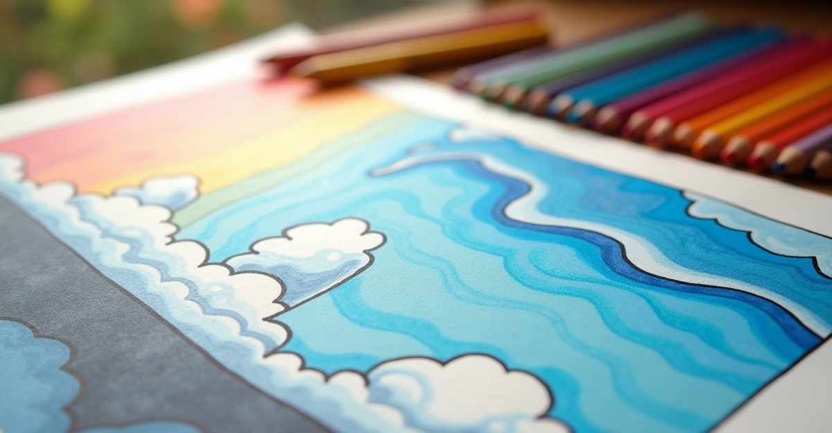
A clear sky is not one shade of blue. It transitions from deep blue at the top to pale blue or white near the horizon. This gradient is what makes a sky look real.
Start with your darkest blue at the top edge of the sky area. Use light pressure and horizontal strokes, working left to right. After the first band, switch to a slightly lighter blue and overlap the bottom edge of the previous band by about half an inch. Continue stepping down through progressively lighter blues until you reach the horizon.
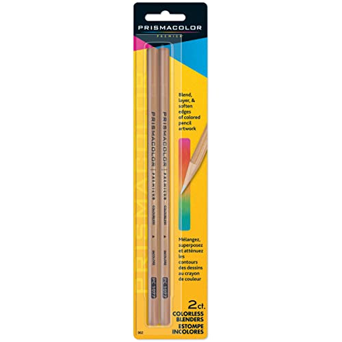
To smooth the transitions between bands, use a colorless blender pencil with light, circular motions at each color boundary. The blender softens the edge where two blues meet, creating a seamless gradient.
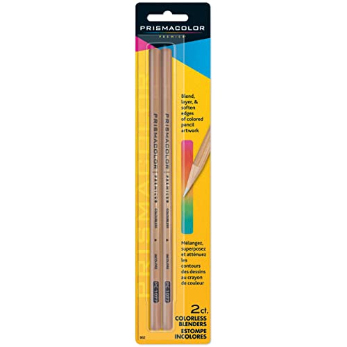
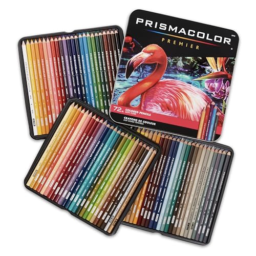
If you’re using Prismacolor Premier pencils, the soft wax cores blend easily for this technique. The Light Blue, Cloud Blue, and Powder Blue shades in the 72-set are ideal for sky gradients.
Cloudy Sky: Volume and Shadow
Clouds are not white. They’re white on top where the sun hits them, and gray or blue on the bottom where they block their own light. The most common mistake is coloring clouds pure white, which makes them look like holes cut in the sky.
For each cloud:
- Leave the top surface white or nearly white. Use the lightest pressure with a white or cream pencil.
- Color the bottom edge with a light gray or pale blue. This is the shadow side.
- Blend the transition between the white top and the shadowed bottom with a colorless blender.
- Deepen the shadow at the very bottom of the cloud where it’s thickest. Add a slightly darker gray or blue here.
The sky between clouds should still have the gradient described above. Clouds sit on top of the sky, so color the sky first, then add clouds.

Sunset Sky: Warm Gradients
Sunset skies use the same gradient technique as clear skies, but with warm colors. Start at the top with a medium blue or purple, transition through orange and pink in the middle, and end with yellow or pale orange near the horizon.
The transition from blue to orange is where most people struggle. Blue and orange are complementary colors, so blending them directly creates a muddy brown. Instead, place a band of pink or purple between the blue and orange. Pink bridges the warm and cool colors without muddying the gradient.
For sunset clouds, the shadows are warm, not cool. Use pale orange or pink for the cloud shadows instead of gray. The sun illuminates clouds from below during sunset, so the bottom of each cloud catches warm light while the top is in shadow.
Tools That Make Sky Coloring Easier
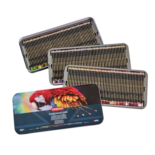
Soft wax-based pencils are better for skies than hard oil-based pencils. The soft cores blend more easily, which matters for smooth gradients. Prismacolor Premier is the standard choice. Derwent Chromaflow is a cheaper alternative with a similar soft core.
A colorless blender is essential. Skies demand smooth transitions, and a blender pencil is the fastest way to achieve them. See our blending tools guide for options.
Light pressure matters more than the specific pencils you use. Heavy pressure creates visible stroke lines that are hard to remove. Build color with two or three light layers instead of one heavy layer.
Read while you color. Kindle Unlimited includes thousands of art and coloring books you can read on any device. Try Kindle Unlimited FREE for 2 months
Common Sky Coloring Mistakes
One flat blue. Real skies always have a gradient. Even on a clear day, the horizon is lighter than the zenith.
Hard edges between color bands. If you can see where one blue ends and another begins, you need to blend more. Use the colorless blender at each transition.
Pure white clouds. Clouds have shadows. Without shadow color on the bottom, they look like flat shapes, not three-dimensional objects.
Coloring over the whole sky uniformly. The sky changes color based on distance from the horizon. Start dark at the top and work lighter as you go down.
Bottom Line
Skies come down to gradients, soft blending, and understanding cloud shadows. Color the sky first with a light-to-dark gradient, then add clouds with white tops and gray-blue bottoms. For sunsets, bridge warm and cool colors with pink. For more technique guides, see our blending and shading guide and colored pencil recommendations.
🎨 Get Your Free Stress Relief Coloring Guide
Join our newsletter and get this free printable plus weekly tips.
Price Check
Prices verified via our product tracker. Updated Sep 27.
| Amazon.com : Prismacolor Premier Colored Pencils, Soft Cor | $74.99 | 4.8★ (29,632) |
| Amazon.com : Derwent Chromaflow Pencils, Set of 150 in Tin | $149.99 | 4.5★ (3,059) |
As an Amazon Associate we earn from qualifying purchases.