This article contains affiliate links. We may earn a commission from qualifying purchases.
Some content on this site is AI-assisted and reviewed by our editorial team.
Coloring Wood Grain and Stone Textures with Colored Pencils
After fur, metal, and sky, the next textures that trip up colorists are wood and stone. Both seem simple because we see them every day, but translating their patterns onto paper requires a different approach than smooth surfaces. Wood has directional grain. Stone has random speckling. Getting these right adds realism to any coloring page with furniture, buildings, or natural scenes.
Disclosure: As an Amazon Associate, ColoredCalm earns from qualifying purchases. This post contains affiliate links, which means we may earn a commission if you click through and make a purchase, at no additional cost to you.
I’ll break down each texture into its core pattern, then show you how to build it with colored pencils.
Wood Grain: Direction Is Everything
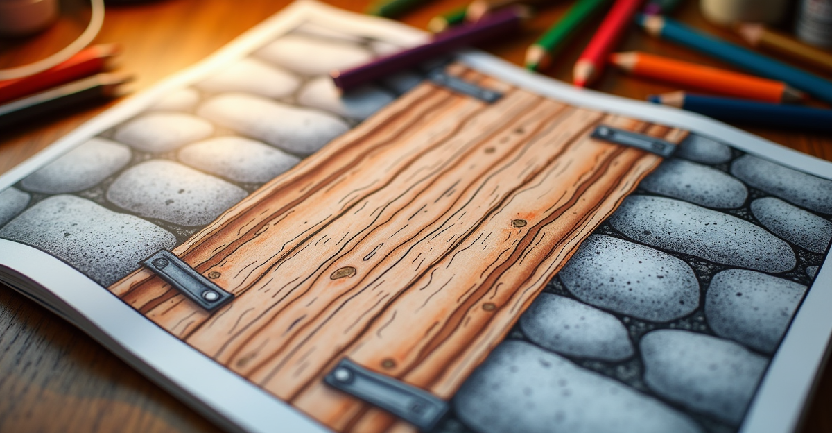
Wood grain runs in one direction along the length of the board or branch. The most common mistake is coloring wood with random strokes, which eliminates the grain pattern and makes the surface look like cardboard.
To color wood grain:
- Choose your base color. Warm brown for oak, reddish-brown for cherry, pale yellow for pine. Apply this as a flat layer with strokes running along the length of the wood.
- Add darker grain lines using a sharpened pencil with medium pressure. These lines should be slightly wavy, not straight. Real grain has gentle curves and occasional knots.
- Vary the spacing between grain lines. Some should be close together, others far apart. Uniform spacing looks like laminate, not real wood.
- Add a few short perpendicular strokes at knot locations to suggest the circular grain pattern that forms around them.
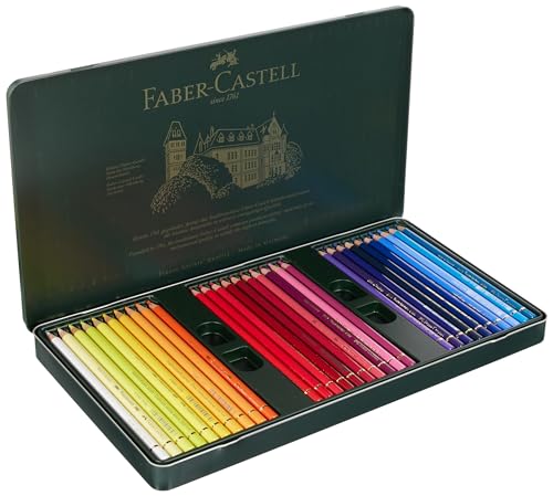
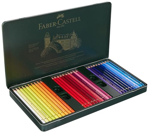
Use a Faber-Castell Polychromos set for wood grain if you have one. The hard oil-based cores hold a sharp point for the fine grain lines, and the transparent layers let the base color show through.
Adding Depth to Wood
Wood surfaces have depth. A table top catches light on the surface, but the grain creates subtle shadows within the wood itself. To add this depth:
After your base color and grain lines, go back with a slightly darker shade of your base color and apply it between the grain lines with light pressure. This pushes the grain lines forward visually, making them look raised. Then add a lighter shade on top of the grain lines themselves to simulate where light catches the raised grain.
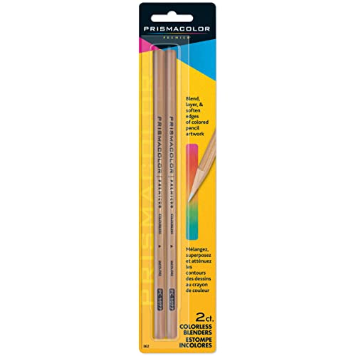
For a polished wood surface (like furniture), blend the entire surface lightly with a colorless blender after the layers are complete. This softens the grain slightly, simulating the smooth finish of varnished wood. For raw wood (like an unfinished plank), skip the blending step and leave the texture rough.
Stone: Random Speckling, Not Solid Color
Stone surfaces are made of mineral grains of different colors and sizes. The key to coloring stone is abandoning uniform coverage. Instead of filling the area with one color, use a speckling technique with multiple related colors.
To color stone:
- Choose three or four related colors. For gray stone: light gray, medium gray, dark gray, and a touch of brown or blue. For sandstone: cream, tan, ochre, and light brown.
- Apply the lightest color as a base with light, irregular strokes. Don’t cover the area completely. Leave small gaps of white paper.
- Add the mid-tone color in irregular patches, overlapping some of the base color and leaving new gaps.
- Scatter the darkest color as small dots and short strokes randomly across the surface. These are the mineral grains.
- Optionally, add a few dots of an unexpected color (a touch of blue, green, or rust) to simulate mineral variation.
The result should look speckled and irregular, not smooth. If the surface looks too uniform, add more dark dots until the texture reads as gritty.
Stone Wall Patterns
For stone walls in coloring pages, each stone should have its own speckled pattern, but the mortar between stones should be a different, lighter color. Start with the mortar lines, then color each stone individually with the speckling technique above.
Vary the base color slightly between adjacent stones. If every stone is the same gray, the wall looks fake. Alternate between warm gray and cool gray, or mix in a stone with brown or tan tones.
Not a Prime member yet? Get FREE 2-day shipping on millions of items, plus access to Prime Video, Prime Music, and Prime Reading. Start your 30-day Prime free trial
Tools for Texture Work
Both wood and stone benefit from pencils that hold a sharp point. The fine lines in wood grain and the small dots in stone speckling require precision.
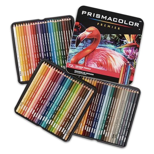
Polychromos holds a point better than any wax-based pencil. If you’re using Prismacolor Premier, sharpen frequently and use light pressure to avoid breaking the soft core during fine detail work.
A reliable sharpener is essential. See our sharpener guide for recommendations. For blending wood surfaces, a blending tool helps smooth polished finishes.
Bottom Line
Wood grain needs directional strokes with wavy lines and varied spacing. Stone needs random speckling with multiple colors and deliberate irregularity. Both textures require a sharp pencil point and light pressure. For more technique guides, see our blending guide and pencil recommendations.
🎨 Get Your Free Stress Relief Coloring Guide
Join our newsletter and get this free printable plus weekly tips.
Frequently Asked Questions
How do you color realistic wood grain?
Draw the grain first in light warm brown strokes that follow the growth lines, then layer darker between them and burnish with cream. Grain is rhythm, not detail.
What colors make stone look real?
Cool greys with warm browns in the shadows and a pale blue-grey pass over the highlights. Real stone is never one grey - it is 3-4 temperatures overlapping.
How do I keep textures from looking flat?
Vary your stroke direction between layers and leave a few highlights untouched. Texture reads when light is inconsistent - perfect even shading is what makes it fake.
Price Check
Prices verified via our product tracker. Updated Sep 27.
| Amazon.com: Polychromous Colored Pencil Set In Metal Tin 6 | $79.56 | 4.8★ (4,529) |
| Amazon.com : Prismacolor Premier Colored Pencils, Soft Cor | $74.99 | 4.8★ (29,632) |
As an Amazon Associate we earn from qualifying purchases.