This article contains affiliate links. We may earn a commission from qualifying purchases.
Some content on this site is AI-assisted and reviewed by our editorial team.
Target keyword: how to blend colored pencils
(8,100/mo), colored pencil shading techniques (4,400/mo), blending
colored pencils for beginners (2,900/mo)
Meta description: Learn how to blend and shade
colored pencils with beginner-friendly techniques. From burnishing to
layering, master the skills that turn flat coloring into art.
Category: Techniques / Tutorials
Tags: colored pencils, blending, shading, art
techniques, adult coloring, mindfulness Affiliate tag:
strongdogsmar-20 (Amazon), Blick (5-7%)
Why Blending Changes
Everything
You bought a coloring book, grabbed your pencils, and started filling
in shapes. The results were… fine. But you’ve seen those pages online —
the ones that look painted, not penciled. The ones with smooth
gradients, glowing highlights, and depth that makes you forget you’re
looking at paper.
That’s not talent. That’s technique. Specifically: blending
and shading.
The good news? These are learnable skills. You don’t need art school.
You don’t need expensive supplies (though we’ll recommend some worth the
upgrade). What you need is a clear guide, and that’s exactly what this
is.
The 4 Blending Methods
(Pick One to Start)
1. Layering (Pressure Blending)
The idea: Build color gradually by applying multiple
light layers instead of one heavy pass.
How to do it: 1. Start with your lightest color 2.
Apply with very light pressure, you should barely see pigment 3. Add
3-4 thin layers, gradually increasing pressure 4. Your top color (the
one you want most visible) goes on last with medium pressure
Best for: Smooth gradients, sky transitions, skin
tones Works with: Any pencil brand, but softer cores
(like Prismacolor) layer more easily
Pro tip: If your hand is making a scratching sound
on the paper, you’re pressing too hard. Back off.
2. Burnishing
The idea: Use a colorless blender or a light-colored
pencil with heavy pressure to “melt” layers together into a smooth,
paint-like finish.
How to do it: 1. Build up 3-4 layers of color using
the layering method above 2. Take a colorless blender pencil (or a
white/cream pencil) 3. Apply firm, even pressure in small circular
motions 4. The wax in the pencil heats up slightly from friction and
fuses the layers
Best for: Polished, saturated finishes; making
colors look vivid Works with: Wax-based pencils
(Prismacolor, Crayola), oil-based pencils don’t burnish as well
Pro tip: Burnishing is a one-way trip. Once you
burnish, you can’t add more layers on top. Save it for your final
step.
3. Solvent Blending
The idea: Use a mild solvent to dissolve pencil
wax/oil and create watercolor-like smooth blends.
How to do it: 1. Apply your colored pencil as normal
(layering works best) 2. Dip a cotton swab or small brush in rubbing
alcohol or odorless mineral spirits 3. Gently brush over the colored
areas in the direction of your blend 4. The solvent melts the binder and
lets colors merge smoothly
Best for: Ultra-smooth backgrounds, sky gradients,
large area blending Works with: Both wax- and oil-based
pencils
Safety note: Use in a ventilated area. Odorless
mineral spirits (like Gamsol) are safer than regular mineral spirits.
Keep away from kids and pets.
4. Blender Pen / Marker
Blending
The idea: Use a clear blender marker (like the
Tombow Dual Brush Blender or Copic Colorless Blender) over pencil to
create smooth transitions.
How to do it: 1. Apply your pencil color 2. Use the
blender marker to “push” the pigment around 3. Works like solvent
blending but without the chemical smell
Best for: Quick blending, detail work, mixed media
pieces Works with: Most pencil brands, but works
especially well on smoother paper
Shading: How to Make Things
Look 3D
Blending makes things smooth. Shading makes things real.
Here are the 5 shading techniques that matter most for coloring book
artists:
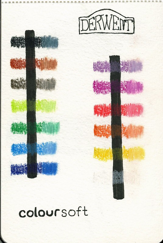
1. Value Mapping (Start Here)
Before you touch pencil to paper, decide where your light source is.
Then map three zones:
- Highlights, Where light hits directly (lightest
color or leave paper white) - Midtones. The base color of the object (your main
pencil) - Shadows, Where light doesn’t reach (your darkest
shade)
Exercise: Take a simple circle. Decide light comes
from the upper left. Color the upper-left area light, the middle medium,
and the lower-right dark. Blend the transitions. You just made a
sphere.
2. Hatching
Parallel lines drawn in one direction. Closer lines = darker. Wider
spacing = lighter.
Best for: Architectural elements, hair, fur, adding
texture to shadows
3. Cross-Hatching
Hatching + a second set of lines at an angle. The intersection
creates natural darkness.
Best for: Deep shadows, adding drama, vintage/etched
look
4. Stippling
Dots. Lots of dots. More dots = darker. Fewer dots = lighter.
Best for: Texture (sand, stone, rough surfaces),
pointillist style
Warning: It’s meditative and tedious.
Perfect for mindfulness coloring, rough on your wrist.
5. Smooth Gradient Shading
The holy grail. Light-to-dark transition with no visible lines or
bands.
How to practice: 1. Draw a rectangle 2. Start at one
end with heavy pressure (dark) 3. Gradually reduce pressure as you move
across 4. The goal: you can’t tell where one shade ends and the next
begins
This single skill will transform your coloring pages more than
anything else.
The Supply Shortlist
(What Actually Matters)
You don’t need every product below. But if you’re going to invest in
blending and shading, these are the tools that make the biggest
difference:
Pencils
- Prismacolor
Premier 48ct, Soft wax core, best for layering &
burnishing (~ dollars25) - Faber-Castell
Polychromos 36ct, Oil-based, won’t break, excellent for
detail (~ dollars35) - Crayola
Colored Pencils 50ct, Surprisingly decent for beginners
learning layering (~ dollars8)
Blending Tools
- Prismacolor
Colorless Blender, Best burnishing pencil (~ dollars6) - Gamsol
Odorless Mineral Spirits 4.2oz, Solvent blending, very
smooth (~ dollars12) - Tombow
Dual Brush Pen Blender, Marker blending over pencil
(~ dollars4) - Blending
Stumps & Tortillions Set, Solvent blending, detail
work (~ dollars6)
Paper
- Strathmore
400 Series Toned Gray Sketch Pad, Mid-tone paper = instant
depth (~ dollars10/pad) - Strathmore
400 Series Drawing Pad 9×12, Classic white, good tooth for
layering (~ dollars8/pad)
Budget tip: Start with Crayola + a colorless blender
+ regular printer paper. You’ll learn the techniques just fine. Upgrade
when you feel the tools limiting you, not before.
3 Beginner Projects to
Practice Right Now
Project 1: The
Gradient Sphere (15 minutes)
Skills: Layering, value mapping, smooth gradient
- Draw a circle
- Pick any color, say, blue
- Light source: upper left
- Lightly layer blue on the lower right (shadow side)
- Add white/light blue on the upper left (highlight)
- Burnish the whole thing with a colorless blender
- You should see a smooth transition from light to dark
What you learned: How pressure + layering creates 3D
form.
Project 2: The Sunset
Strip (20 minutes)
Skills: Solvent blending, color transitions
- Draw a tall rectangle
- Color the top third yellow, middle third orange, bottom third
red - Overlap slightly where colors meet
- Use a cotton swab with rubbing alcohol to blend the transitions
- The colors should merge like a watercolor sunset
What you learned: Solvent blending makes
impossible-smooth gradients.
Project 3:
Shading a Coloring Book Page (30 minutes)
Skills: Everything combined
- Pick a simple coloring book page (flowers, mandala, or
geometric) - Choose a light source direction (upper left is easiest)
- For each section:
- Identify highlight, midtone, and shadow zones
- Layer your colors from light to dark
- Burnish for a polished finish or leave layered for a softer
look
- Step back and compare it to a flat-colored version
What you learned: How all the techniques work
together on a real project.
Common Mistakes (And How to
Fix Them)
- Banding (visible stripes in gradients), Pressure
changes too abruptly. Fix: Layer lighter, use more passes with less
pressure. - Wax bloom (white haze on finished work), Wax rises
to surface over time. Fix: Burnish as a final step, or spray with
fixative. - Can’t add more color. You already burnished too
early. Fix: Don’t burnish until your LAST layer. - Colors look muddy, Mixing too many colors, or
complementary colors. Fix: Stick to analogous colors (neighbors on color
wheel) for blends. - Paper pilling, Too much pressure on thin paper.
Fix: Use heavier paper (80lb+), or lighter pressure. - Uneven coverage, Skipping areas, inconsistent
pressure. Fix: Work in small sections, use circular motions.
The Mindfulness Connection
Here’s something most art tutorials skip: blending and
shading are mindfulness practices in disguise.
When you’re layering color, watching it build, adjusting pressure,
feeling the pencil move, you’re practicing focused attention. The
repetitive motion activates your parasympathetic nervous system (the
“rest and digest” mode). Your heart rate slows. Your breathing deepens.
Your brain stops racing.
This isn’t woo. Studies on “flow state” show that structured creative
activities reduce cortisol by up to 25% and increase dopamine. The key
is the structured part, that’s what distinguishes
mindful coloring from passive distraction.
Blending and shading give your brain exactly the right amount of
challenge: not so easy you zone out, not so hard you stress. That’s the
sweet spot.
So the next time someone asks why you spend 45 minutes shading a
single flower, tell them it’s cheaper than therapy and more effective
than scrolling.
What’s Next?
- Want more techniques? Check out our 5
coloring techniques that will transform your first book, layering,
burnishing, and beyond. - Looking for the right pencils? Our best
colored pencils for adult coloring guide breaks down the options by
budget. - Just want to relax? Grab a coloring book and a
basic pencil set and just… start. The techniques will come.
ColoredCalm is about creativity that calms. No perfectionism
required.
Affiliate Disclosure: This post contains affiliate
links. If you purchase through them, we may earn a commission at no
extra cost to you. We only recommend products we genuinely think are
worth it.
n
Bottom Line
Blending and shading are the techniques that separate flat coloring from dimensional, professional-looking work. Practice with a colorless blender and layered pressure control. Once these click, every coloring page improves.
🎨 Get Your Free Stress Relief Coloring Guide
Join our newsletter and get this free printable plus weekly tips.