This article contains affiliate links. We may earn a commission from qualifying purchases.
Some content on this site is AI-assisted and reviewed by our editorial team.
How to Color Fur and Texture with Colored Pencils: A Practical Guide
Coloring fur is one of those skills that separates beginners from intermediate colorists. Flat color looks fine for geometric mandalas, but animal fur demands direction, strand variation, and layered depth. The good news is that the techniques for fur transfer to any textured surface: wood grain, fabric folds, stone, and feathers all follow the same principles.
Disclosure: As an Amazon Associate, ColoredCalm earns from qualifying purchases. This post contains affiliate links, which means we may earn a commission if you click through and make a purchase, at no additional cost to you.
I’ll walk through the core technique, then break it down by fur type. You don’t need special pencils for this. Whatever you’re currently using will work.
The Core Technique: Directional Strokes
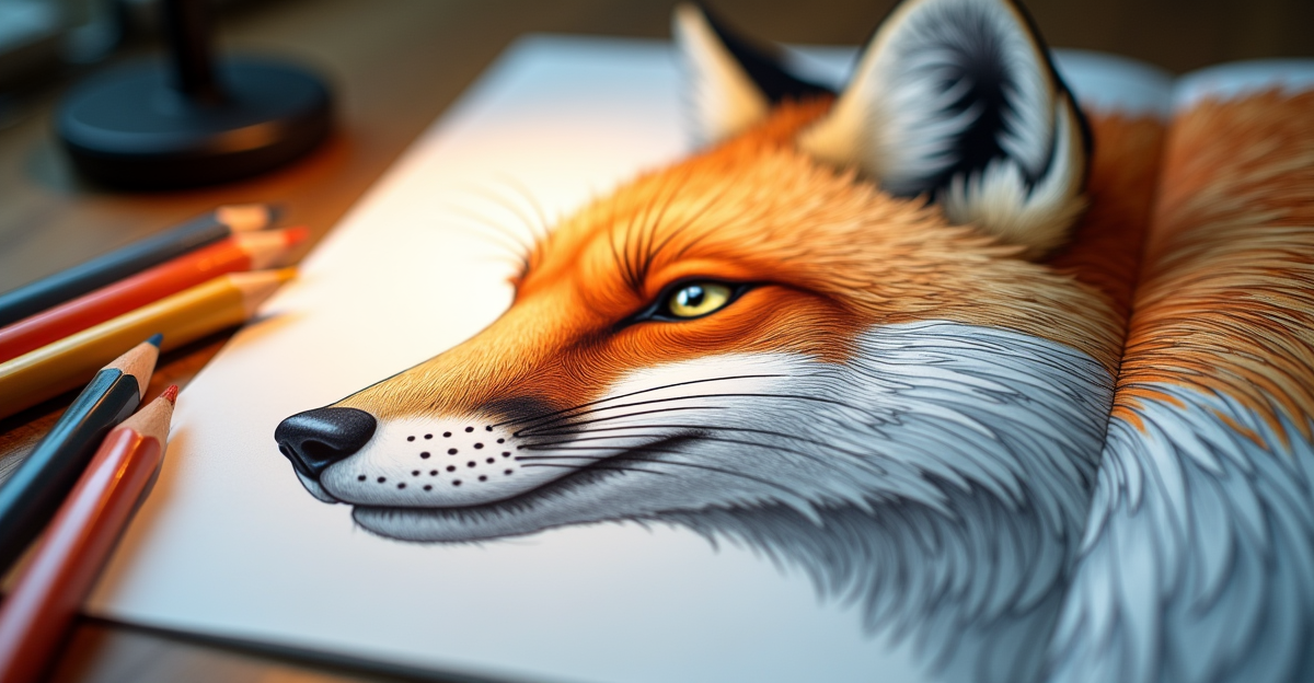
Fur is made of individual hairs, all pointing in the same general direction but with slight variations. To replicate this, use directional strokes instead of filling areas with circular or back-and-forth motions. Each stroke represents one hair.
Hold your pencil at a low angle, almost parallel to the paper, and use the side of the core for broad strokes. For fine individual hairs, hold the pencil upright and use a sharp point with light pressure. The sharp point creates a thin line that tapers as the core lifts off the paper.
Stroke in the direction the fur grows. For a cat’s face, that means radiating outward from the nose. For a dog’s body, strokes follow the contour of the muscle underneath. If you stroke against the grain, the fur looks wrong even if the colors are correct.
Layering for Depth
Real fur has multiple layers. The undercoat is short, dense, and usually a lighter or darker shade than the topcoat. The guard hairs are longer, coarser, and more visible. To build this depth:
- Start with the undercoat color as a base layer. Use short, multidirectional strokes to create a textured foundation.
- Add the mid-tone color with longer directional strokes on top. Leave gaps where the undercoat shows through.
- Finish with the topcoat color using the longest, finest strokes. These should be sparse, not dense.
The gaps between your topcoat strokes are what create the fur texture. If you fill in every gap, it looks like flat color again. Leave breathing room.
Short Fur vs Long Fur
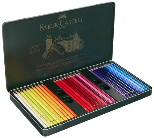
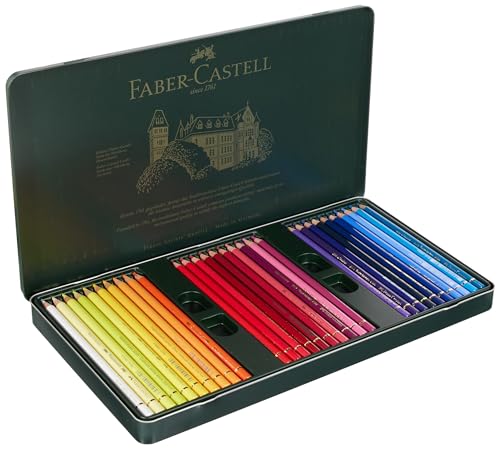
Short fur (like a horse or short-haired cat) requires tightly packed short strokes. Use a Faber-Castell Polychromos set if you have one. The hard oil-based cores hold a sharp point for the fine, precise strokes short fur needs.
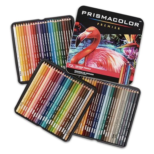
Long fur (like a Golden Retriever or Maine Coon cat) allows for longer, flowing strokes. A Prismacolor Premier set works well here. The soft wax core lays down smooth, flowing color that blends naturally between strokes, giving long fur a soft transition between colors.
Creating Shine on Fur
Animal fur catches light differently depending on whether it’s clean, oily, or dusty. For a glossy coat (like a healthy horse or a show dog), leave narrow bands of white paper where the light hits, then color the fur around those bands. The uncolored paper acts as your highlight.
For a matte, dusty coat (like a wild wolf or barn cat), don’t leave white gaps. Cover the whole area with mid-tone strokes and add darker strokes for shadow areas. The absence of bright highlights gives the fur a natural, unpolished look.
Color Choices for Realistic Fur
Fur is rarely a single color. A brown dog’s coat might contain tan, chocolate, cream, gray, and black hairs all mixed together. To avoid the “flat brown” look, use three or four related colors and alternate them randomly in your stroke layers.
For black fur, avoid using only black. Mix in dark brown, dark blue, and dark purple. Pure black looks like a void. Adding near-black colors gives depth and makes the fur read as real instead of colored-in.
For white fur, use light gray, cream, and pale blue for shadows. Pure white paper is your base. The shadows define the fur shape.
Listen while you color. Audible has thousands of audiobooks perfect for coloring sessions. Try Audible FREE for 3 months
Common Mistakes
Stroking too hard. Heavy pressure creates broad, flat lines that look like paint, not fur. Use light pressure and let multiple strokes build the texture gradually.
Uniform stroke length. Real fur has varying hair lengths. Mix short and long strokes in the same area to avoid the “bristle brush” look.
Ignoring the undercoat. Skipping the base layer and going straight to individual hairs looks sparse and scratchy. The undercoat provides the body that topcoat strokes sit on top of.
Using a dull point. A dull pencil tip makes wide strokes that look like shading, not fur. Sharpen frequently. A good sharpener is essential for fur technique.
Bottom Line
Fur texture comes from directional strokes, layered depth, and varied stroke length. Start with your undercoat, add directional topcoat strokes, and leave gaps for texture. Use related colors instead of a single flat tone. For more technique guides, see our blending and shading guide and our colored pencil recommendations.
🎨 Get Your Free Stress Relief Coloring Guide
Join our newsletter and get this free printable plus weekly tips.
Price Check
Prices verified via our product tracker. Updated Sep 27.
| Amazon.com: Polychromous Colored Pencil Set In Metal Tin 6 | $79.56 | 4.8★ (4,529) |
| Amazon.com : Prismacolor Premier Colored Pencils, Soft Cor | $74.99 | 4.8★ (29,632) |
As an Amazon Associate we earn from qualifying purchases.