
This article contains affiliate links. We may earn a commission from qualifying purchases.
Some content on this site is AI-assisted and reviewed by our editorial team.
How to Color Metallic and Shiny Effects with Colored Pencils
Metallic surfaces look impossible to color. Chrome, gold, copper, silver. They seem to require a completely different approach than skin, fabric, or foliage. The trick isn’t special pencils. It’s understanding that shiny surfaces reflect their environment, and that means using colors you wouldn’t expect.
Disclosure: As an Amazon Associate, ColoredCalm earns from qualifying purchases. This post contains affiliate links, which means we may earn a commission if you click through and make a purchase, at no additional cost to you.
I avoided metallic objects for months. Every time I tried to color a knight’s armor or a decorative bowl, it looked flat and wrong. Then I learned a few principles that changed everything. Let me walk you through them.
Principle 1: Metal Is Not Gray
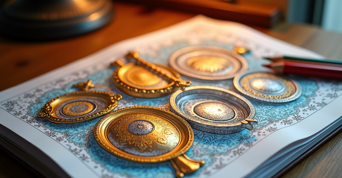
The most common mistake is coloring metal with gray pencils. Real metal reflects whatever is around it. A chrome sphere sitting on a green tablecloth will have green in its lower half. A gold pendant worn against a blue shirt will pick up blue reflections.
Instead of reaching for your gray pencil, look at the reference image (or imagine the scene) and identify what colors are being reflected. A typical metallic surface has:
- Dark areas where the object reflects shadow or its own deepest contours
- Mid-tones that pick up surrounding colors (warm if near warm light, cool if near blue or green)
- Bright highlight areas that are nearly white, where direct light hits
Principle 2: Contrast Does the Work
Metal looks shiny because the transition between dark and light is sharp. On a matte surface, light fades gradually. On a shiny surface, it snaps from dark to light in a narrow band.
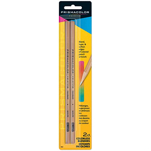
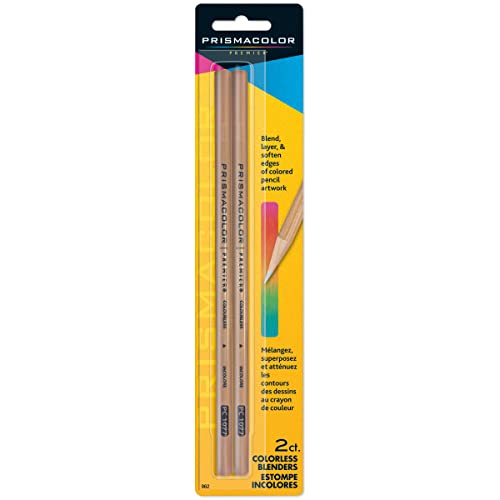
To create this effect with colored pencils, use side-by-side strokes with hard edges. Don’t blend the transition smoothly. A colorless blender is useful for softening adjacent colors, but for metallic effects, leave the edges crisp.
How to Color Chrome and Silver
Chrome reflects everything around it with high contrast. Start with a mid-tone base (light blue or warm gray), then add dark stripes where shadows fall, and leave bright white gaps for highlights. The white of the paper is your brightest highlight, so plan ahead and don’t color those areas at all.
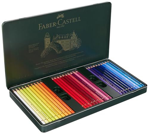
Use a Faber-Castell Polychromos set for crisp lines. The oil-based cores hold a sharp point, which helps with the hard edges chrome requires.
How to Color Gold and Copper
Gold and copper have warm base tones. Start with a yellow-orange or reddish-brown base depending on the metal. Add dark brown or dark red in shadow areas, and use cream or pale yellow for highlights. Gold rarely needs white highlights. The brightest areas are pale yellow, not white.
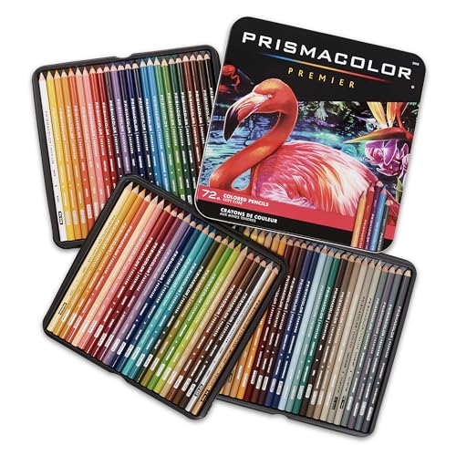
For a rich gold effect, layer in this order: dark brown base, then orange, then yellow on top. The layers create a depth that a single color can’t achieve. If you’re using Prismacolor Premier pencils, their soft wax cores blend these warm layers smoothly.
How to Color Brass and Bronze
Brass is duller than gold, with a greenish-yellow base. Start with a yellow-olive base, add dark brown shadows, and highlight with pale yellow. Bronze is darker and redder. Start with a reddish-brown base, add dark brown or black shadows, and highlight with orange-gold.
The difference between gold, brass, and bronze is mostly in the base color and the depth of the shadows. Gold is the brightest and most yellow. Brass is more muted and slightly green. Bronze is the darkest and most red.
Read while you color. Kindle Unlimited includes thousands of art and coloring books you can read on any device. Try Kindle Unlimited FREE for 2 months
Practice Exercise
Try coloring a simple metal sphere. Draw a circle on white paper. Choose a metal (chrome, gold, or copper). Identify your light source direction. Then:
- Leave a small crescent of white paper where the light hits directly. Don’t color it at all
- Color the area next to the highlight with your lightest metal tone
- Add your mid-tone on the opposite side from the light
- Place your darkest tone in a thin band at the bottom edge
- Add one reflected color from the “environment”. A touch of blue if the surface sits on a blue background
Keep the edges between tones sharp. Step back and look at it from a distance. It should read as shiny, not flat. If it looks flat, increase the contrast between your darkest and lightest areas.
Bottom Line
Metallic effects come from unexpected colors, hard edges, and high contrast. Once you stop reaching for gray and start looking at what the surface actually reflects, your metal coloring will improve immediately. For pencil recommendations, see our colored pencil guide or under 50 dollars guide. For blending tools, check our blending tools guide.
🎨 Get Your Free Stress Relief Coloring Guide
Join our newsletter and get this free printable plus weekly tips.
Price Check
Prices verified via our product tracker. Updated Sep 27.
| Amazon.com: Polychromous Colored Pencil Set In Metal Tin 6 | $79.56 | 4.8★ (4,529) |
| Amazon.com : Prismacolor Premier Colored Pencils, Soft Cor | $74.99 | 4.8★ (29,632) |
As an Amazon Associate we earn from qualifying purchases.