This article contains affiliate links. We may earn a commission from qualifying purchases.
Some content on this site is AI-assisted and reviewed by our editorial team.
Every colorist eventually tries to paint water and gets a blue smear that looks like a swimming pool. Here is why that happens: water is transparent, so what you are actually drawing is not water — it’s what water does to the things around it. It darkens what’s underneath, mirrors what’s above, breaks both into bands of light and ripple shadow, and softens every edge it touches. Once you stop “drawing a lake” and start drawing the sky’s reflection with the bottom’s darkness showing through, water starts behaving on the page.
In this tutorial I will walk through the four moves I use on every body of water — still lakes, moving streams, and the ocean — plus the pencil choices and mistakes that make or break the effect. This builds on the pressure control from our smooth gradients tutorial, so review that if your layers still streak.
Step 1: Map the Reflection Bands Before You Touch Color
Water color is horizontal. Look at any reference photo and you will see the surface organized in horizontal bands: near the shore, sky color bounces straight at you; far from shore, you mostly see into the water; ripple lines chunk everything between them into wavy stripes. With a light pencil pressure (2 out of 10), sketch the horizon line and then the band boundaries — where the far reflection starts, where the ripple zone begins, where a rock or dock splits the surface. This 30-second map is the difference between believable water and wallpaper.

Use a color you’ll paint over later — light blue, pale ochre — never graphite, which smears into your pigment and turns mixed zones muddy under burnishing.
Step 2: Layer the Under-Water Color First (Darkness Shows Through)
Deep water reads dark because the lakebed absorbs light. Choose the “through” color first: ochres and greens for a muddy bottom, teal sliding toward petrol blue at real depth. With medium pressure (4-5 of 10), fill the deep zone in small, tight circles with your mid-tone, then layer the darker tone only where the band map says depth increases. Keep the pencil sharpened to a long, soft point and the strokes tiny — circular strokes hide direction, which is exactly what you want under the later reflection layer.
On the Strathmore 300 Series Bristol Pad (vellum, ~$11), take the under-water layer one value darker than your target — the tooth grabs a surprising amount of wax and lightens everything by roughly one value step. On smoother paper the same layers land closer to your swatch.




Step 3: Lay the Sky Reflection on Top — Lighter, Bluer, Only in Its Bands
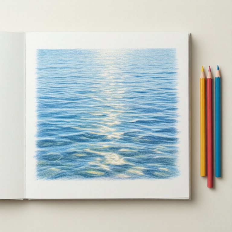
Now the mirror effect. In the bands facing you, the surface shows sky: light blues near the horizon, warmer cream and gold tones at sunrise and sunset — the reference photo above is exactly that golden-hour pattern. With barely-there pressure, layer the sky color over the dark under-water color in rippled horizontal chunks. The dark showing through the gaps is what sells “transparent,” not the reflection itself. Resist covering the whole surface: bare dark gaps between reflection bands = readable water.
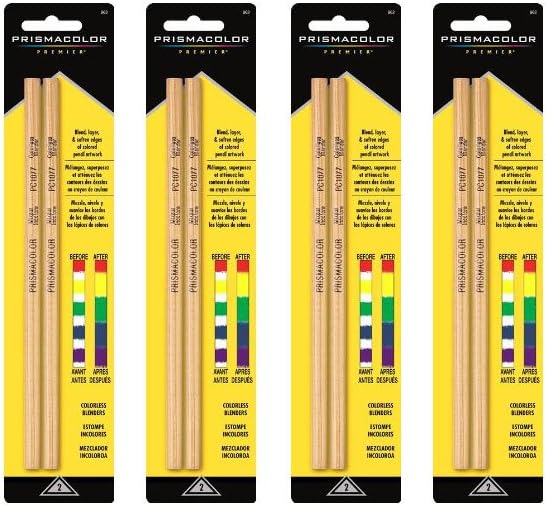
For soft edges between bands, use the Prismacolor Premier Colorless Blender Pencils 2-pack (~$10) in short horizontal strokes — it melts the two layers’ boundary without lightening or shifting hue the way a white-colored-pencil “blend” would.
Step 4: Ripples, Highlights, and Edge Darkening
Ripples are dark lines with bright lines beside them — never drawn alone. With a sharp pencil and light pressure, add horizontal squiggle strokes: dark on the shadow side of each ripple, sky-color or a pure white pencil (~$18 for the Prismacolor Premier White) highlight on the sun side. White with hard pressure also gives the sun’s sparkle path on lakes — short stacked dashes along the light column, not a solid stripe. Finish where water meets shore: darken the waterline where bank sediment shades the first inch of surface, then lift a hair of color where a wavelets washes up.

Common Mistakes (And the Fix)
Uniform blue everywhere. Water is two colors minimum — what’s below and what’s reflected. If your surface is one flat blue, go back to Step 1 and find the bands.
Wavy vertical streaks. Reflections stretch VERTICALLY toward the viewer only when the surface stills; in moving water, reflections shear into horizontal chunks. Streaky vertical strokes read as rain, not ripples.
Outline-drawing the waterline. A hard contour around the water kills the transparency. Break the shoreline edge with light-value interruptions — reflections and sediment color are your transition, not a traced line.
One paper for everything. Texture paper fights soft water: it leaves white specks in the smooth mid-tones. For water-heavy pieces, the smoother Bristol above (or a hot-press sheet) does in 4 layers what rough paper fights through 8.
What You Actually Need (Budget Note)
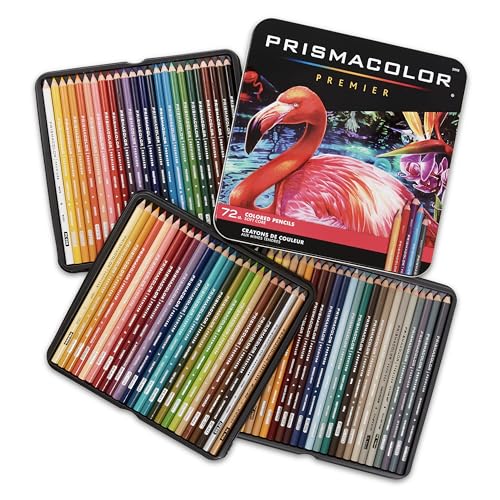
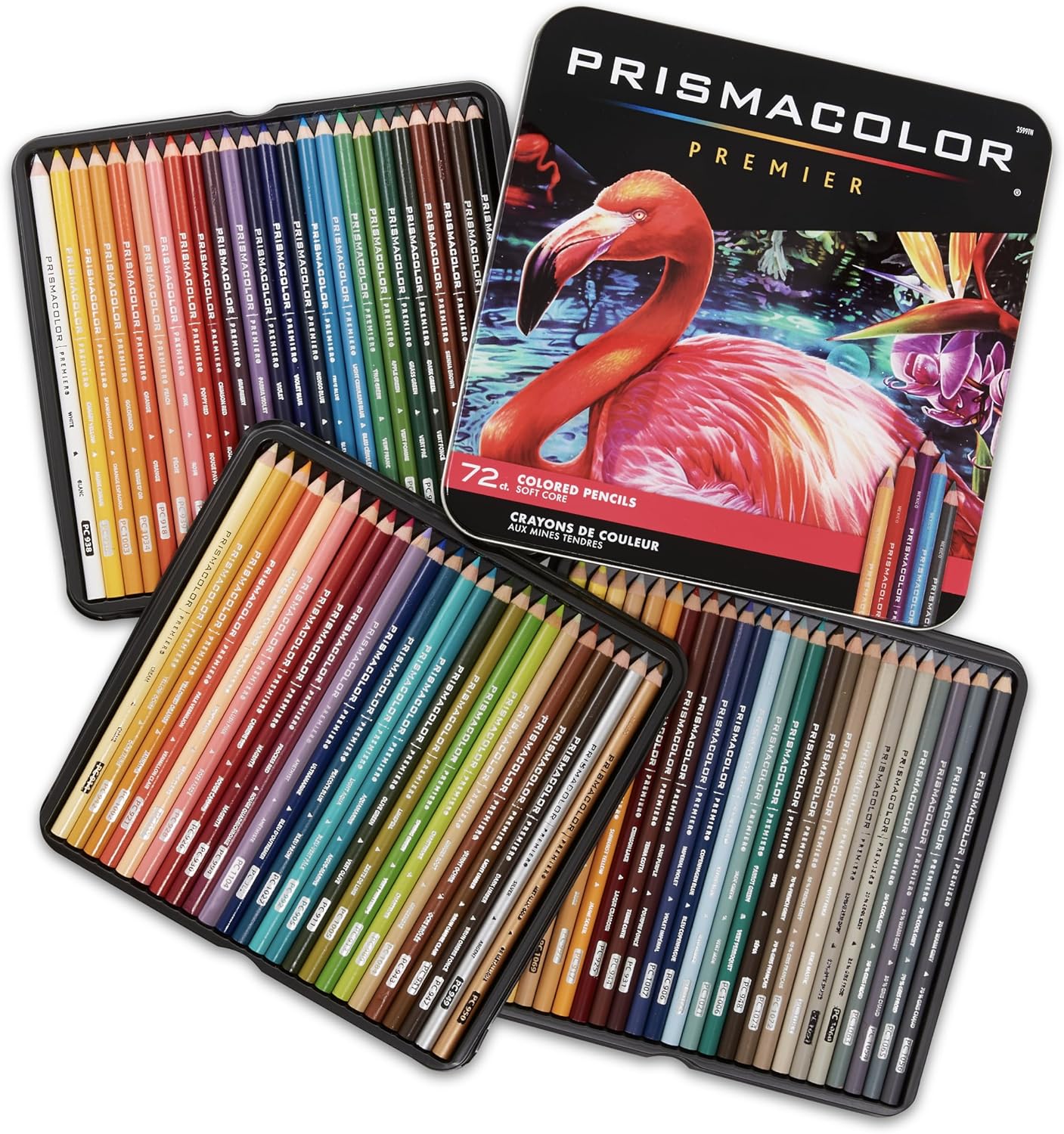
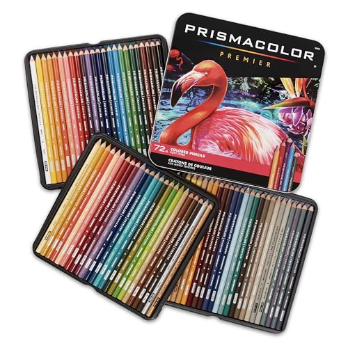
A soft-core pencil set with layered blues and earth tones covers this — a Prismacolor Premier 72-count set at about $75 holds every hue this page needs for years. If you already own any 24+ set and a white pencil, this tutorial costs you nothing but an evening: practice on one 6×8 patch of water, then repeat the identical band logic on a bigger sheet — scale up pressure, never structure.
When you are ready to put the technique to work, our guide to picking paper that grabs pigment pairs with this one — water effects live or die on the surface you build them on.
ColoredCalm is reader-supported. As an Amazon Associate, I earn from qualifying purchases. That means if you buy through one of the links above, I get a small commission at no extra cost to you. I only recommend supplies I use on my own table.
My take: Water is never the subject — it’s the sky’s reflection with the bottom’s darkness showing through, organized in horizontal bands. Map the bands first in a color you’ll paint over, layer the underwater color, then lay the sky’s mirror on top in its own bands, and ripple lines chunk everything between. Practice one 6×8 patch before scaling up; the structure stays identical.
Related guides
- Fire and Candlelight: The Glow-First Method
- How to Color Cozy Cafe Scenes: Steam, Window Light, and Warm Shadows
- Black Paper Coloring with Colored Pencils: A Practical Guide
- Color by Number for Adults: Why This Trendy Format Is More Than Just Following Rules
- How to Color Mandalas Without Losing Your Mind
🎨 Get Your Free Stress Relief Coloring Guide
Join our newsletter and get this free printable plus weekly tips.
Frequently Asked Questions
How do you make water look realistic with colored pencils?
Map the horizontal reflection bands first, lay the dark under-water color, then layer the sky reflection on top in light, broken bands. Water reads as transparent because the darker color shows through gaps in the reflection, not because of a uniform blue wash.
What colors do you use for water in colored pencil?
Use at least two colors: a dark teal, green, or ochre for the under-water depth and a light blue or warm sky tone for the reflections. Morning and evening scenes swap the blue reflection for cream and gold, as long as the dark base stays underneath.
What paper works best for coloring water?
Smooth paper such as Strathmore Bristol vellum keeps the soft midtones of water free of white specks. Heavily textured paper leaves grain showing through the smooth surface, which you would have to burnish away.
Liked this guide? Get the next one in your inbox — the coloring starter checklist is free too.
✓ You're in — check your inbox.
No spam. Unsubscribe anytime. We never share your email.
Prices move fast. Start your Amazon trip from our Shop & Support page and your purchases support ColoredCalm at no extra cost to you.
Price Check
Prices verified via our product tracker. Updated Oct 17.
| Strathmore 300 Series Tape Bound Bristol Pad, 100 lb. Vell | $11.14 | 4.8★ (13,326) |
| Premier Colorless Blender Pencils 2 Packs | $9.74 | |
| 3365 White Colored Pencils 2x12 | $17.09 | 4.8★ (206) |
| Prismacolor Premier Colored Pencils, Soft Core, 72 Count | $74.49 | 4.8★ (29,632) |
As an Amazon Associate we earn from qualifying purchases.