This article contains affiliate links. We may earn a commission from qualifying purchases.
Some content on this site is AI-assisted and reviewed by our editorial team.
Cafe scenes are everywhere in 2026’s bestselling coloring books — cocoa cups on window sills, steam curling off lattes, warm light pooling through rain-streaked glass. They’re also the pages most likely to come out muddy. The problem isn’t your pencils. It’s that cocoa, wood, and shadow all pull from the same brown family, and without a system for separating warm light from warm shadow, everything merges into a single sepia blob by layer three.
Three moves carry every cozy cafe page: a warm-gray shadow family (not brown — gray with warmth), light-from-one-window discipline, and steam drawn as lifted white curls rather than gray scribbles. Master these and your cafe scenes stop looking like mud and start looking like a place you’d want to sit.

Grab your warm-range pencils and a white gel pen. Here’s the technique, step by step.
1. Establish Your Light Source (Before You Touch Brown)
Before you lay down a single stroke, decide where the window is. Every cafe scene has one — usually stage-left or stage-right, and the light comes in at an angle, not straight on. This isn’t optional. If you color without committing to a light direction, you’ll shade both sides of every cup and the scene reads flat.
Mark the window side with a tiny pencil dot in the margin (you’ll erase it later). Everything on that side gets warmer, lighter color. Everything on the opposite side gets cooler, darker shadow. The transition zone — the penumbra where light meets shadow — is where the cozy magic lives.
2. Build the Warm-Gray Shadow Family
Here’s the mistake most colorists make with cafe scenes: they use the same brown for shadows that they use for wood and cocoa. The result is visual soup. Shadows in a warm-lit cafe aren’t brown — they’re warm gray. Think of the color of a coffee shop wall at dusk: not chocolate, not charcoal, but a gray that leans warm.
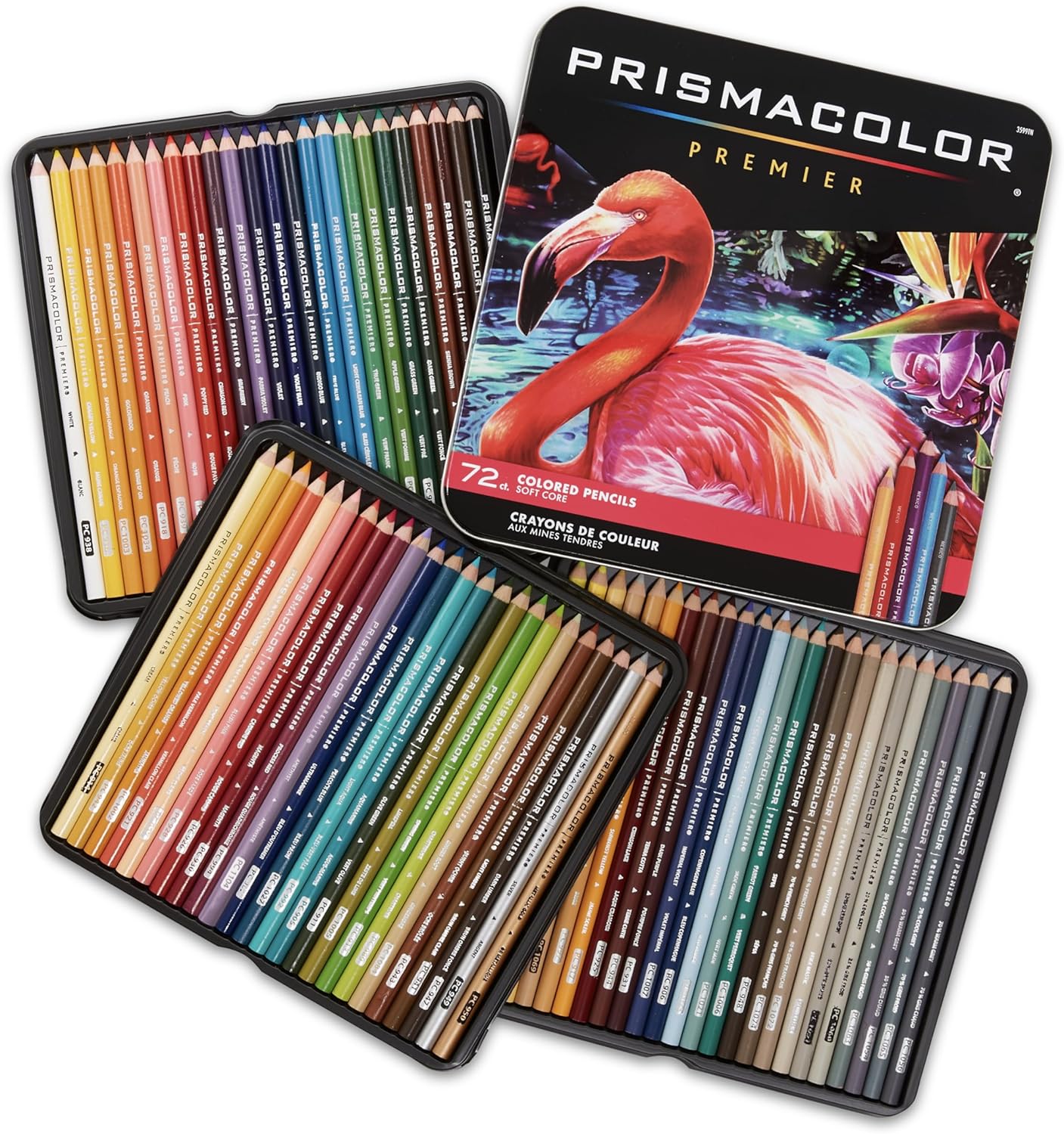
For the Prismacolor Premier Soft Core 72-count set (about $60 on sale), the palette that works:
- Warm shadow base: Warm Gray 30% — lay it down light everywhere shadows fall (underside of cups, under tables, far side of objects)
- Deeper shadow: Warm Gray 50% — add a second layer only in the core shadow (the darkest part, directly opposite the window light)
- Cast shadow on surfaces: Warm Gray 20% — the soft shadow objects throw on the table
The key insight: warm gray reads as “shadow in a warm room.” Brown reads as “another brown object.” Keep your shadows gray and your objects brown, and the scene separates.
Prismacolor soft cores blend beautifully for this — the wax build-up lets you layer warm grays over each other without losing the gray character. The con: soft cores blunt fast on tiny windowpane lines, so keep a sharpener handy and sharpen at a shallow angle to avoid cracking the core.
My take: The 72-count gives you the full warm-gray spread plus the sienna-to-chestnut range cocoa and wood need — it’s the one set that handles an entire cafe scene without borrowing pencils.
3. Color Cocoa and Wood in Separate Brown Families
Cocoa is warm brown — think Dark Umber to Chocolate. Wood is a cooler brown — think Walnut Brown to Light Walnut. The trick is to never let them share a pencil. If your cocoa and your table both use the same Chocolate, the eye can’t separate the cup from the surface.
For cocoa: start with a light base of Cream, then build up with Dark Umber in the shadow side and leave the highlight side at the Cream base. The surface of the coffee (where it meets the cup rim) gets a thin line of Black Cherry — that’s the color of coffee seen from above, not brown.
For wood: use Walnut Brown as the mid-tone and Dark Walnut for grain lines. Add a touch of Sepia in the deepest grain grooves. The wood should read cooler than the cocoa — if they look the same, push the wood cooler with a whisper of Slate Gray over the Walnut.
4. Window Light: The Gradient That Sells the Scene
Window light in a cafe scene is a gradient — bright warm at the window, fading to ambient room tone away from it. This gradient is what makes the scene feel lit rather than just colored.
Build it in three layers:
- Base wash: A very light layer of Cream across everything the window light touches — tabletops, near sides of cups, the wall behind the counter.
- Warm bloom: A light layer of Goldenrod (or Jaune Brillant if you have it) only in the brightest zone — the first inch from the window edge. This is the “sunbeam” warmth.
- Fade: Use a colorless blender or light pressure with White to soften the transition between the bloom zone and the base wash. No hard lines — window light is soft.
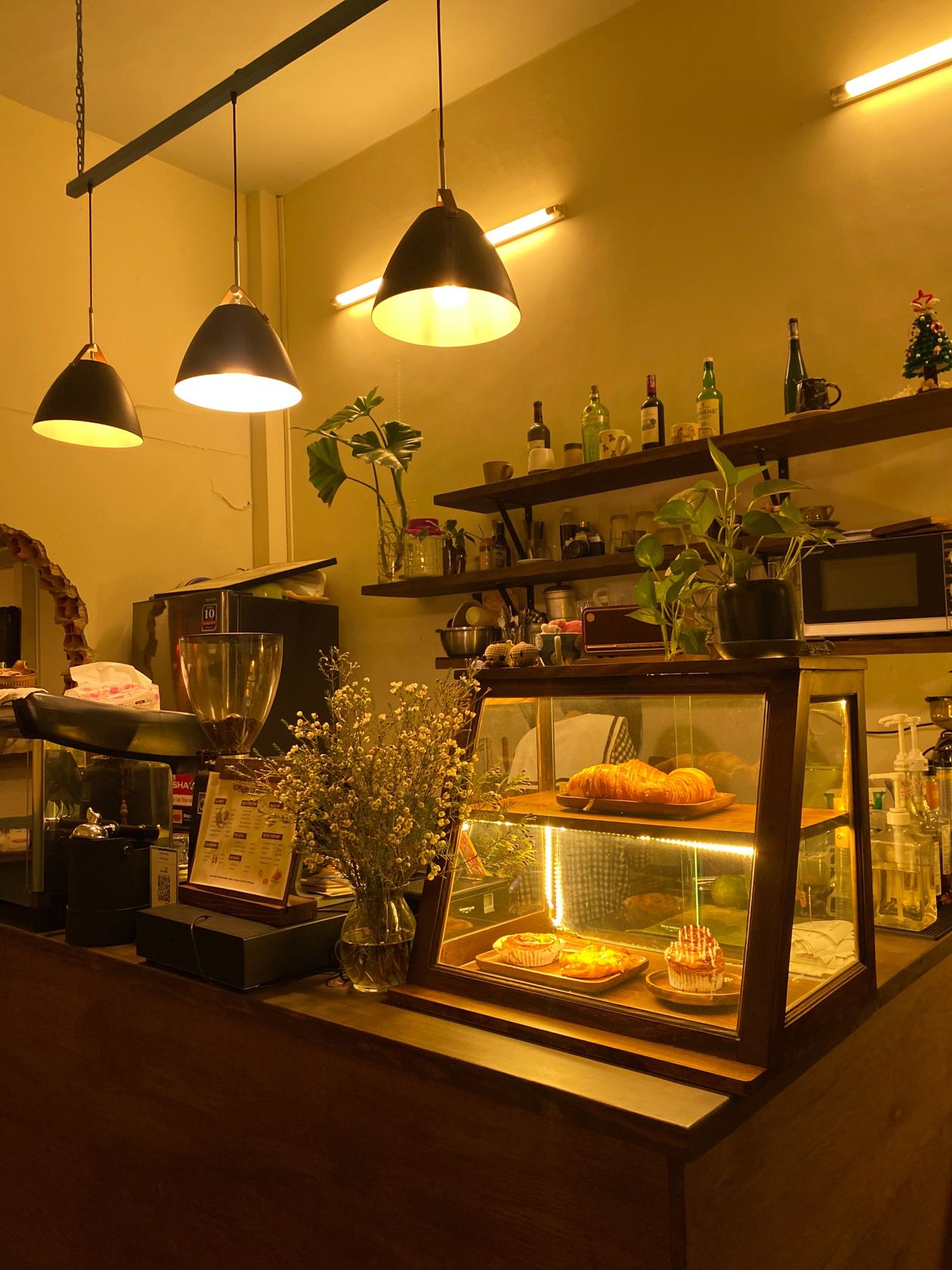
If your scene has a window with visible glass, the glass itself gets a cool wash — a whisper of Sky Blue Light over the Cream — to separate it from the warm interior. The contrast between cool glass and warm room is what makes the scene feel like there’s a real temperature difference between inside and outside.
5. Steam: The White Gel Pen Move Everyone Skips
Steam is the detail that separates a colored cafe scene from a finished one. Most colorists either skip it or try to color it gray — both wrong. Steam in a warm cafe is white, and it reads best drawn over finished pencil with a white gel pen.
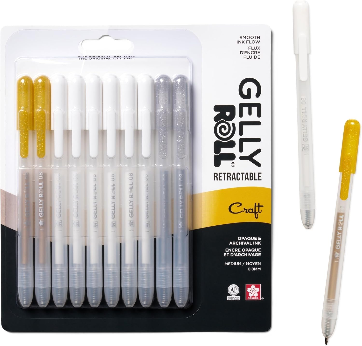
The Sakura Gelly Roll retractable 10-pack (about $18) gives you white, gold, and silver retractables that draw clean steam curls over heavy pencil layers. The technique:
- Draw steam as lifted curls, not straight lines. Start at the cup rim, curve upward and to one side (the side away from the window — steam drifts on air current).
- Use thin, broken lines — steam isn’t solid. Leave gaps in each curl.
- Fade the curls as they rise — press harder near the cup, lighter as you go up.
- Add a few tiny dots of white above the curls for dissipated steam.
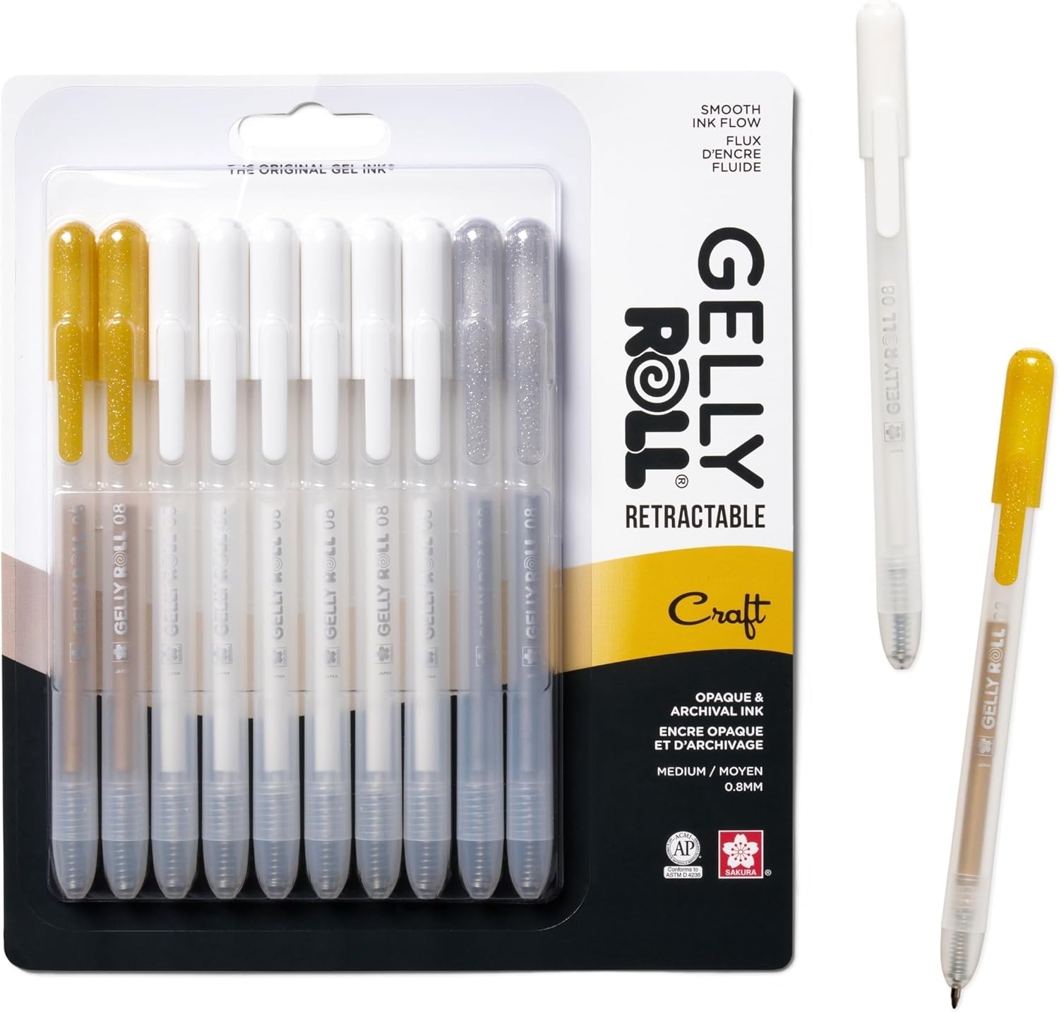
The con with gel pens over colored pencil: gel skips over heavy wax bloom. Test a corner of your page first — if the pen skates without laying down ink, lightly scuff the area with a kneaded eraser to break the bloom, then draw.
My take: The retractable Gelly Roll is the only pen I’ve found that reliably writes white over finished Prismacolor layers — the steam trick alone is worth the $18.
Practice Book: Where to Try This

Cozy Christmas by Coco Wyo (under $10) is the practice book I’d start with. Big cozy scenes with cocoa cups, window seats, and enough complexity for a single sitting — perfect for working through the five steps above without spending two days on one page. The pages are thin, so if you’re using markers alongside pencils, put a blotter sheet behind your working page.
My take: The best sub-$10 practice book for cafe scenes — the window-seat and cocoa-cup pages are made for this technique, and the single-sitting complexity means you finish pages instead of abandoning them.
Toned Paper: The Shortcut for Dim-Cafe Studies
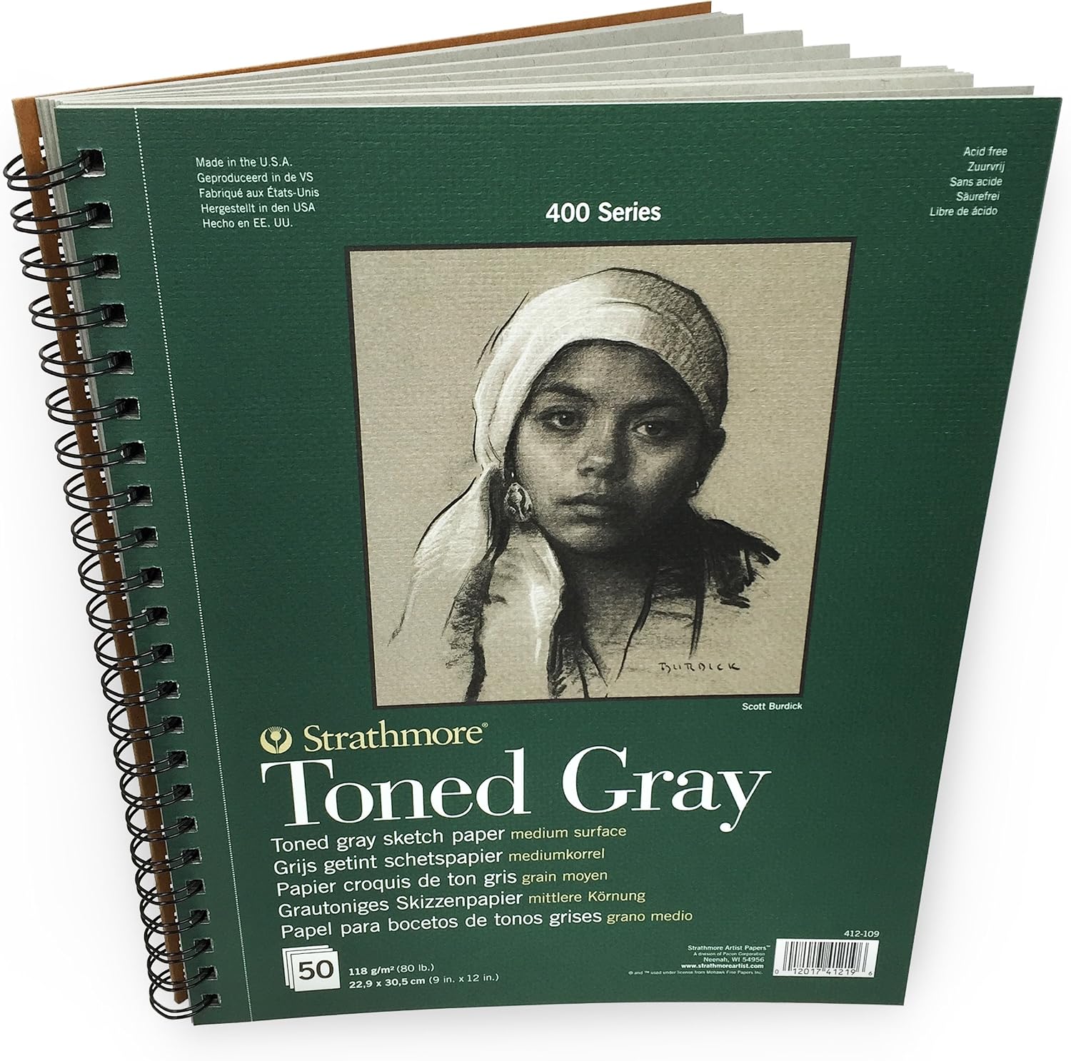
If you want to fast-track the warm-shadow system, try the Strathmore 400 Series Toned Gray pad (about $10). The mid-tone gray paper hands you the dim-cafe half of the scene for free — your shadows are already laid down by the paper itself. You only add light (white and cream pencils) and dark (warm gray and brown), and the mid-tone does the rest. It’s the fastest way to understand how warm shadows work without building them from scratch on white paper.
The 80-lb sheets will buckle under heavy marker work, so keep this one pencil-only. For a full toned-paper deep-dive, see our guide on toned-paper coloring with the mid-tone method.
My take: The fastest teaching tool for understanding warm shadows — the paper does half the work, and you’ll internalize the gray-vs-brown distinction in one session.
Common Mistakes
Brown shadows on brown objects. If your shadow under a cocoa cup is the same brown as the cocoa, the cup disappears into the table. Switch to warm gray for shadows — always.
Steam drawn as solid gray lines. Steam is white, intermittent, and curved. Gray solid lines read as smoke from a fire, not steam from a latte.
Light from both sides. If you can’t tell which side the window is on when you step back from the page, you haven’t committed to a light direction. Pick one side and darken the other.
Forgetting the cool glass wash. Window glass is cooler than the room. A whisper of Sky Blue Light over the window area separates glass from the warm interior and sells the inside-outside temperature contrast.
The Budget Setup
If you’re starting from zero: the Prismacolor 72-count ($60 on sale) plus the Sakura Gelly Roll 10-pack ($18) plus Cozy Christmas ($10) gives you everything you need to work through every technique on this page for about $88. Skip the toned gray pad for now — it’s a shortcut, not a necessity, and you’ll learn more building shadows from scratch on white paper first.
Keep reading: For more colored pencil technique, check our guide on grip-friendly supplies for arthritic hands and our toned-paper mid-tone method guide — both build on the layering and pressure control this technique depends on.
Deep-focus coloring hits different with an audiobook — Audible’s free trial is here. (I get a commission if you sign up, at no extra cost to you.)
ColoredCalm is reader-supported. As an Amazon Associate, I earn from qualifying purchases. That means if you buy through one of the links above, I get a small commission at no extra cost to you. I only recommend supplies I actually color with.
Related guides
- How to Fix Coloring Mistakes (Without Starting Over)
- Stained Glass Coloring Books: How to Create Window-Worthy Art With Just Colored Pencils
- How to Color Fur and Texture with Colored Pencils: A Practical Guide
- How to Color Autumn Leaves Without Turning Them to Mud
- Reverse Coloring Books: Why Coloring the Background First Changes Everything
🎨 Get Your Free Stress Relief Coloring Guide
Join our newsletter and get this free printable plus weekly tips.
Frequently Asked Questions
How do you color steam with colored pencils?
Don't color steam with pencils at all — draw it over your finished pencil work with a white gel pen like the Sakura Gelly Roll. Draw steam as lifted curls (not straight lines), use thin broken strokes with gaps, press harder near the cup rim and lighter as the steam rises, and add tiny white dots above the curls for dissipated steam.
What colors make a cozy scene feel warm?
Use a warm gray family for shadows (Warm Gray 20-50%), Cream and Goldenrod for window light areas, and separate your browns into two families: warm browns (Dark Umber, Chocolate) for cocoa and food, cooler browns (Walnut, Dark Walnut) for wood and furniture. A whisper of Sky Blue Light on window glass creates the warm-inside vs cool-outside contrast.
How do you color window light coming into a room?
Build the light as a gradient in three layers: a light Cream wash across everything the light touches, a Goldenrod bloom only in the brightest zone near the window, and a colorless blender or White to soften the transition. Keep all light coming from one direction — mark the window side before you start and warm that side while darkening the opposite side.
Liked this guide? Get the next one in your inbox — the coloring starter checklist is free too.
✓ You're in — check your inbox.
No spam. Unsubscribe anytime. We never share your email.
Prices move fast. Start your Amazon trip from our Shop & Support page and your purchases support ColoredCalm at no extra cost to you.
Price Check
Prices verified via our product tracker. Updated Oct 31.
| Prismacolor Premier Colored Pencils, Soft Core, Assorted C | $74.29 | 4.8★ (61,977) |
| Sakura Gelly Roll Retractable Gel Pens, White, Gold & Silv | $19.23 | 4.4★ (1,685) |
| Cozy Christmas: Coloring Book for Adults and Kids (Cozy Sp | $9.99 | 4.6★ (2,035) |
| Strathmore 400 Series Wire Bound Toned Sketch Pad, 80 lb. | $15.58 | 4.8★ (11,394) |
As an Amazon Associate we earn from qualifying purchases.