This article contains affiliate links. We may earn a commission from qualifying purchases.
Some content on this site is AI-assisted and reviewed by our editorial team.
Flat color killed more of my early pages than wrong paper ever did. You pick the right blues for a sky, lay them down with patient strokes — and the result is a flat, plasticky band of color that looks like it came out of a marker, not a pencil. The problem is never the pencil. It’s that a real sky — or a rounded vase, or a cheekbone — is never one color; it’s a run of values getting lighter or darker, and your hand needs a repeatable way to walk from one to the other. That’s what a gradient is: value control, applied in layers. Once you can lay a clean gradation, everything else improves — skin, metal, water, backgrounds. Here’s the method I teach, then the pencils and paper that make it easier.
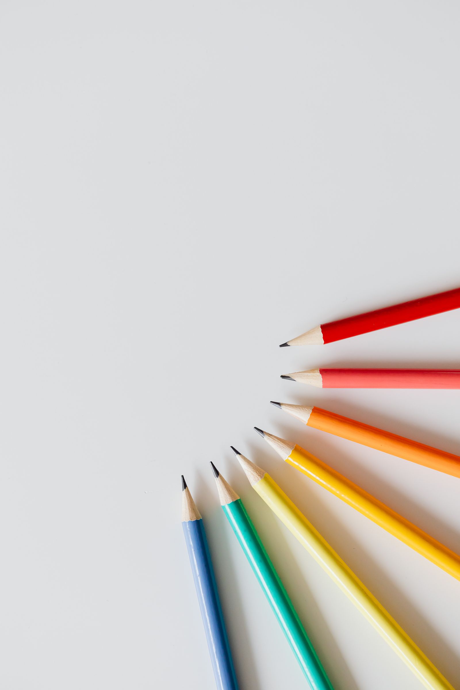
Fifteen years of teaching this, and the same three mistakes kill every bad gradient. Here’s how to fix them.
The Four-Step Gradient Method
Step 1: Pick a two-pencil value run. A clean gradient doesn’t need seven pencils — it needs the same hue in at least two values: one light (sky blue), one darker (indigo). Lay swatches of both on your actual paper before you commit; the pairing decides whether the blend will be smooth or muddy.
Step 2: Pressure map — light on light. Start your first layer at the light edge with the LIGHT pencil and almost no pressure (a 1–2 on a 10 scale — the weight of the pencil itself plus a whisper). Make each stroke slightly longer than the zone you’re filling, and overlap each pass over the last by about a third of a stroke. Pressure is what creates banding: push harder on a transition and the wax piles up in strips.
Step 3: Cross-hatch, don’t scribble. Direction of strokes is your texture. Lay the first pass along the gradient’s direction, then cross at a slight diagonal with the second value — the crossing fills the tooth without visible seams. Around 6–8 total layers per zone is normal; resist fewer-heavy-layers, which is exactly how you get wax buildup and shine.
Step 4: Burnish the seam — or don’t. If the seam is still visible after the layers, one pass with a colorless blender at the boundary melts it clean — two strokes, not ten (burnishing compresses the tooth and stops all further layering, so it’s a finisher, never a fixer mid-process). For skies I usually skip it: a slightly toothy seam looks more natural than glass.
Common Mistakes (All Three Are Pressure)
Banding: hard-edged stripes down the gradient — you’re changing pressure in chunks instead of gradually. Fix: more layers at lower pressure, and let the pencil’s own value run do the transition.
Glassy shine: wax bloom’s first cousin — you burned through the tooth with heavy layers. Fix: fewer, lighter layers; save burnishing for the last 10% of the job.
Muddy mid-zone: the light and dark picks were complementary-leaning cousins (yellow + purple) and every overlap is a third gray. Fix: keep the run within one hue family, and pick your dark to be the SAME pigment family — sky blue + indigo blends; sky blue + plum turns to mud.
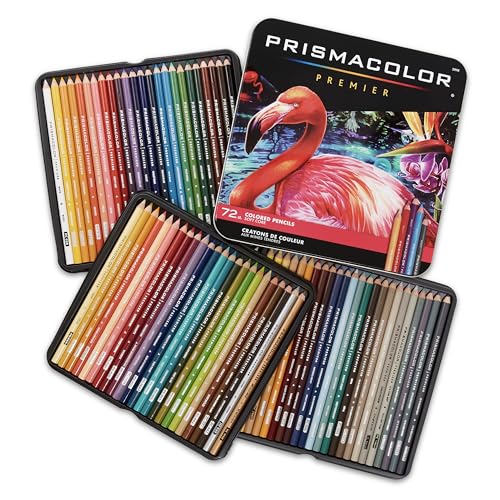
Prismacolor Premier 72 — The Soft-Core Standard for Smooth Runs
Check the price of the Prismacolor Premier 72 on Amazon
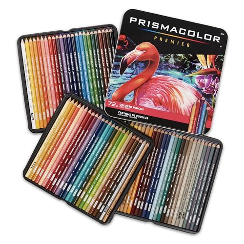
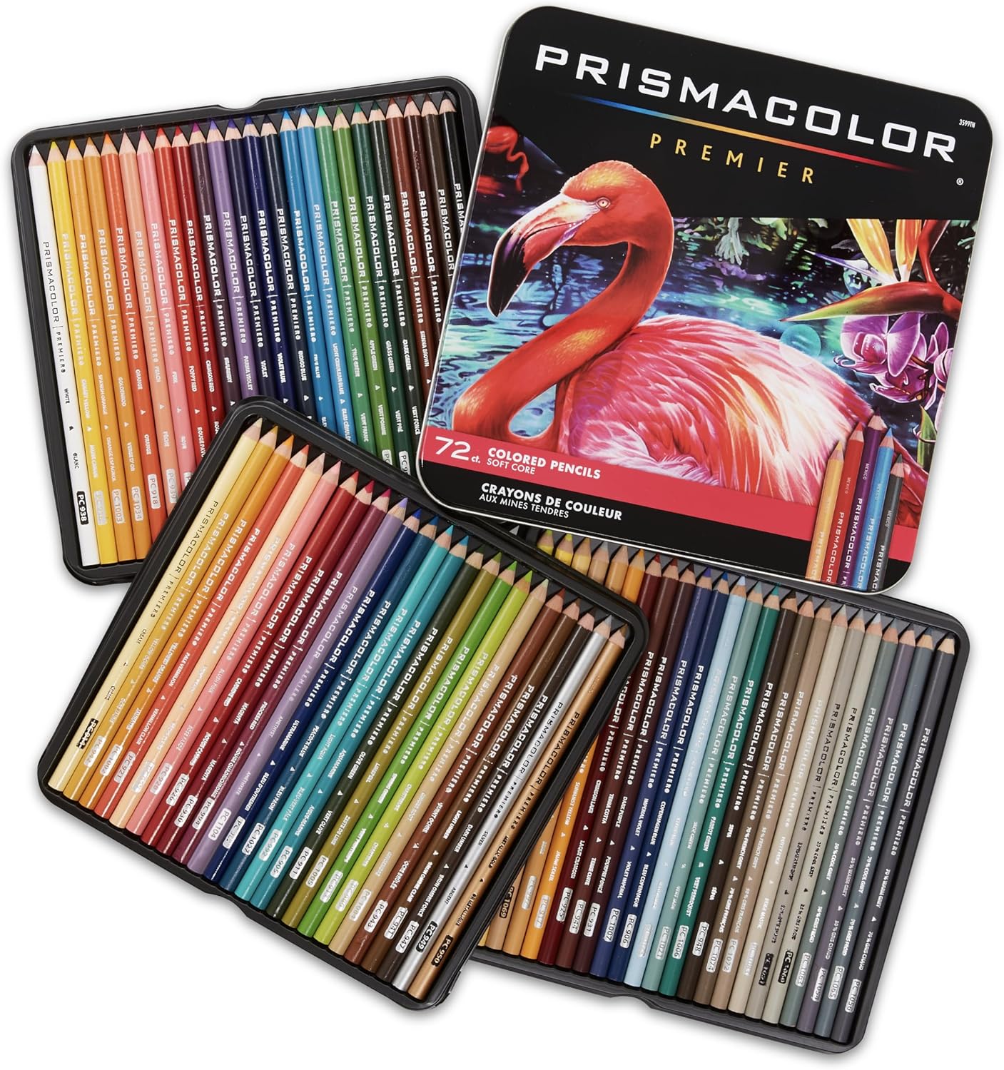
About $75 · 72 colors, soft wax core · the biggest value-run selection in soft core
Gradients live or die on having close value steps in the same hue family, and Premier’s 72-count is where those runs get easy — three or four blues within two steps of each other, same for greens and the warm grays you need for skin-to-shadow runs. The soft core lays down with minimal pressure, which is exactly what a banded gradient needs: less pressure means more layers, and more layers means smoother seams.
Con: soft cores snap when sharpened aggressively and the barrels show every scuff — and Prismacolor’s quality control wanders: expect a scratchy or off-center core in about one pencil per set.
My take: the default gradient set for a reason; if you buy one set to learn value control with, buy this one.
Prismacolor Premier Colorless Blender (2-Pack) — The $10 Seam Melter
Check the price of the Prismacolor Premier Colorless Blender on Amazon
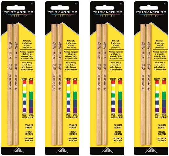
About $10 for a 2-pack · wax binder, no pigment · melts seams and evens layers
The four-step method’s Step 4 needs exactly one tool, and this is it: a pencil-shaped stick of wax binder with no pigment in it. One pass where a light value meets a dark one and the boundary dissolves — useful on rounded objects where a visible seam reads as a drawing mistake. Because it loads more wax onto the paper, it also evens out layered zones that ended up streaky. Two pencils cost less than a set upgrade, which makes it the cheapest way to improve finished gradients this week.
Con: it’s a one-way door — burnished areas refuse new layers and accept nothing afterward, so keep it away from regions you still plan to build color on. It also works only with wax-based cores; oil-based pencils barely respond to it.
My take: buy it with your first serious set, not before the method is drilled — used too early it becomes a crutch that skips layering entirely.
Strathmore 300 Bristol Pad — The Paper Half of the Equation
Check the price of the Strathmore 300 Bristol on Amazon

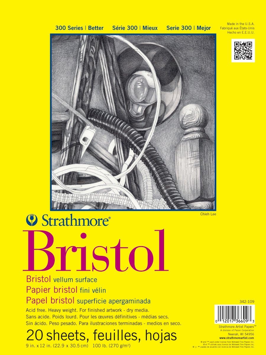

About $11 for 20 sheets · 100 lb vellum surface · takes 8+ layers without shining
A gradient is a stack of layers — and stack-friendliness is a paper property. The 300-series Bristol vellum has enough tooth to grab 8 layers of wax without pilling, and heavy enough stock (100 lb) that layer 8 doesn’t distort the sheet. Budget sketch pads can’t do it: the tooth fills by layer 3 and every pass after just polishes the shine in.
Con: vellum surface tooth shows in cross-hatch strokes — if you want ultra-smooth blends on fine-art portraits, a plate/smooth Bristol is the better surface, at the same price.
My take: the practice-pad default for gradient drills; buy two, you’ll fill the first one drilling skies.
Shuttle Art 36 Seascape — The Budget Value-Run Set
Check the price of the Shuttle Art 36 Seascape set on Amazon
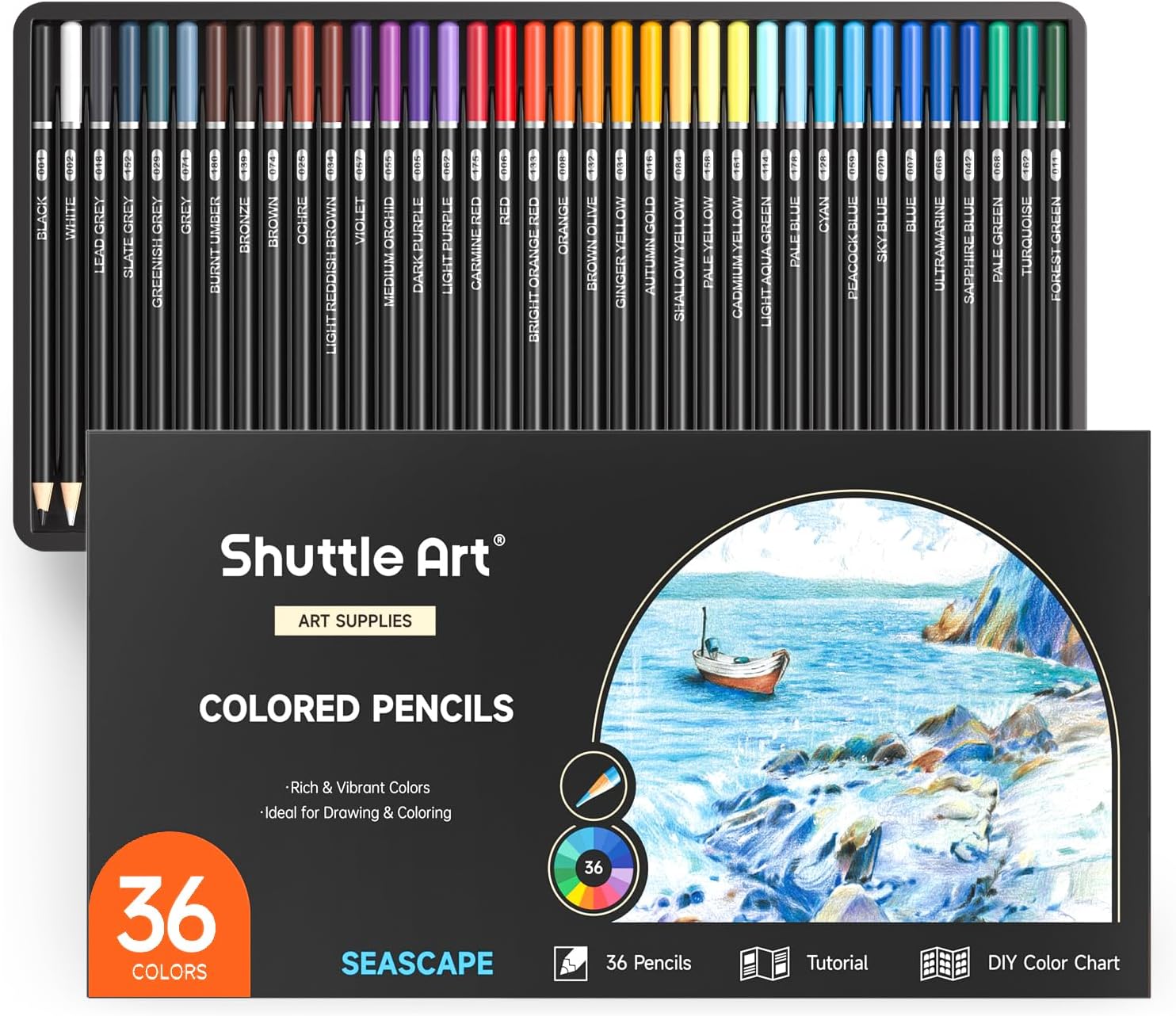
About $10 · 36 colors themed around water/sky tones · soft core
The cheapest way to practice this specific technique: a themed set pre-loaded with blues, teals, grays — almost a pre-built palette for sky-and-water gradients. It won’t match Premier’s layering feel, but at $10 it removes every excuse to not drill the four-step method for a week.
Con: pigment load is lighter; expect more layers for the same coverage, and lightfastness on cheap cores is a gamble for anything you plan to frame.
My take: the drill pad for beginners — learn the method here, then move the skill up to better pencils.
What to Color After You’ve Learned It
A gradient technique needs pages that reward it — big skies, ocean scenes, rounded objects. Three books worth coloring with this skill:
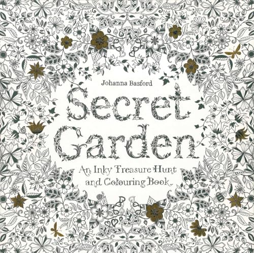
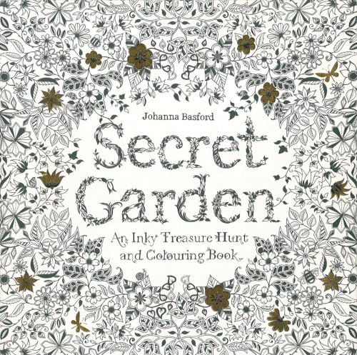
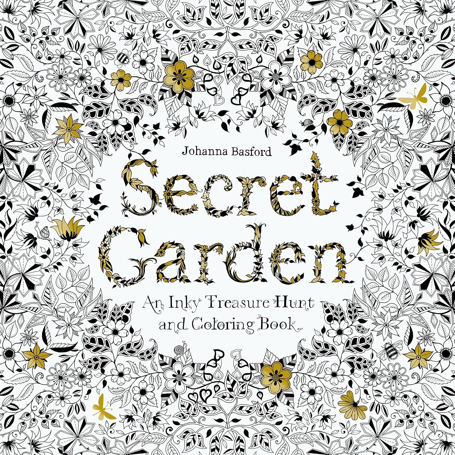
Secret Garden (Johanna Basford, about $16) — garden foliage and flowers are pure gradient drills in leaf veins and petal shading, and the imagery is what made adult coloring a phenomenon.
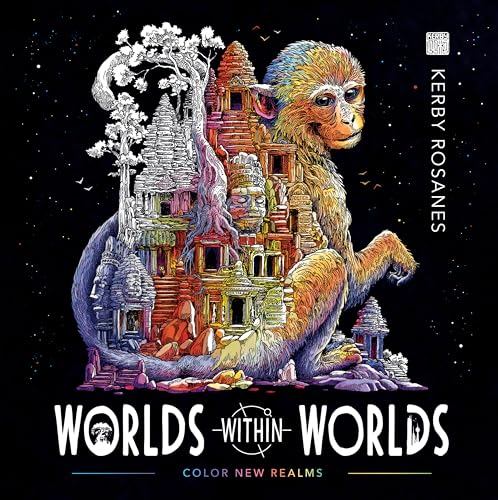
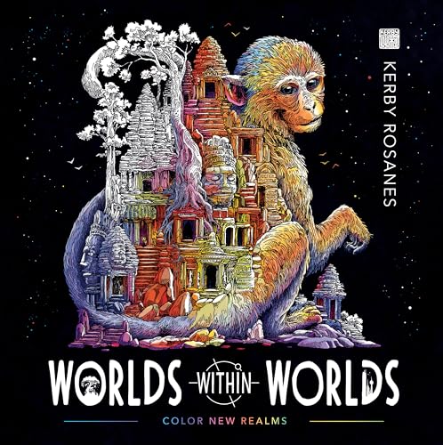
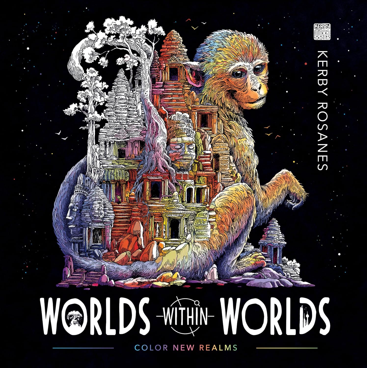
Worlds Within Worlds (Kerby Rosanes, about $15) — nested shapes inside shapes; every ring is a gradient lane, and the designs look genuinely impressive finished.
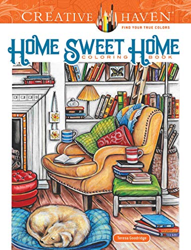
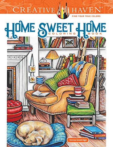
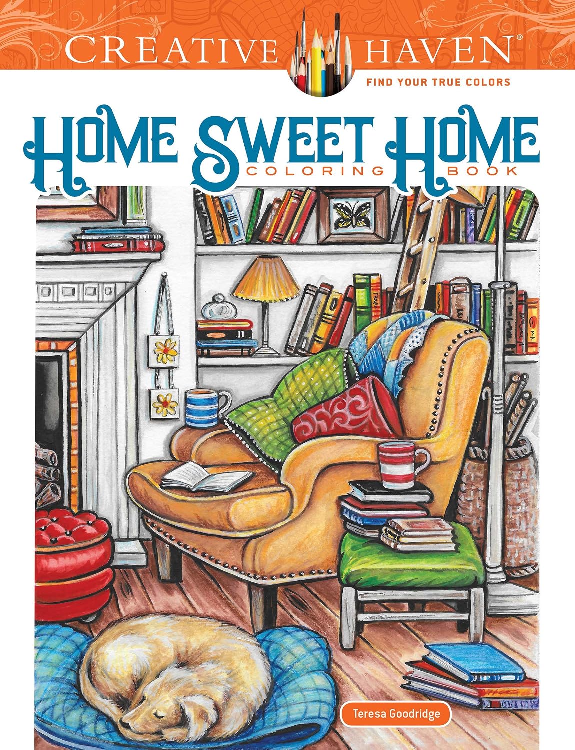
Creative Haven Home Sweet Home (about $8) — interior scenes with wood, walls, and windows; the cheapest of the three and perfect for practicing background gradations behind furniture.
This technique pairs better with supplies on Prime than with anything in a craft-store aisle — a 30-day Prime free trial gets the pad and the set shipped in two days. Cancel before renewal, pay nothing.
The Budget Setup That Still Works
A $30 setup teaches this better than a $200 one: Shuttle Art 36 ($10) + Strathmore Bristol pad ($11) + a school pencil sharpener you already own. Drill the four steps for a week on cheap paper — you’ll out-learn the expensive-set-first plan. Upgrade only when the drill pages look cleaner: Premier 72 next ($75), Polychromos only after months of layering.
When you’re ready for harder surfaces, the black paper guide flips this method (white gradients on dark — same pressure logic, inverted), and the paper-picking guide goes deeper on tooth and weight than this post has room for.
Deep-focus coloring runs even better with an audiobook — Audible’s free trial gets you one free audiobook to test the combo. (Yes, that link is an affiliate link too.)
ColoredCalm is reader-supported. As an Amazon Associate, I earn from qualifying purchases. That means if you buy through one of the links above, I get a small commission at no extra cost to you. I only recommend supplies I actually color with.
Related guides
- How to Host a Coloring Party That Actually Feels Fun (Not Awkward)
- Christmas Ornaments in Colored Pencils: Shiny Spheres Without the Flat Look
- How to Color Skies and Clouds with Colored Pencils
- Coloring on the Go: How to Build a Travel Coloring Kit That Fits in Your Bag
- Toned-Paper Coloring With Colored Pencils: The Mid-Tone Method
🎨 Get Your Free Stress Relief Coloring Guide
Join our newsletter and get this free printable plus weekly tips.
Frequently Asked Questions
How do you make smooth gradients with colored pencils?
The two-pencil method: same hue in two values, light pencil starting at the light edge with almost no pressure, overlapping strokes by a third each pass, then cross-hatching at a slight diagonal to fill the tooth without seams — 6-8 light layers, never fewer heavy ones. Burnish the seam only if it's still visible, and only at the very end.
Why do my color gradients look banded or muddy?
Both are pressure errors — banding means you're changing pressure in chunks instead of gradually, and muddy mid-zones mean your light and dark picks leaned complementary (yellow plus purple makes gray at every overlap). Stay within one hue family and let more, lighter layers do the transition.
Should I burnish every gradient?
No — burnishing compresses the paper tooth and stops all further layering, so it's a finisher, never a mid-process fix. One pass with a colorless blender at the seam only if needed; for skies a slightly toothy seam actually looks more natural than glass.
Liked this guide? Get the next one in your inbox — the coloring starter checklist is free too.
✓ You're in — check your inbox.
No spam. Unsubscribe anytime. We never share your email.
Prices move fast. Start your Amazon trip from our Shop & Support page and your purchases support ColoredCalm at no extra cost to you.
Price Check
Prices verified via our product tracker. Updated Oct 17.
As an Amazon Associate we earn from qualifying purchases.