This article contains affiliate links. We may earn a commission from qualifying purchases.
Some content on this site is AI-assisted and reviewed by our editorial team.
Target keyword: coloring techniques (6,600/mo),
adult coloring techniques (3,600/mo), how to improve coloring pages
(2,900/mo)
Disclosure: As an Amazon Associate, ColoredCalm earns from qualifying purchases. This post contains affiliate links, which means we may earn a commission if you click through and make a purchase, at no additional cost to you.
Meta description: Stop coloring flat pages. These 5
techniques, layering, burnishing, shading, color lifting, and stippling
, will make your coloring look professional, even if you’re just
starting out.
Category: Coloring Tips Tags:
coloring techniques, shading, blending, adult coloring, tips, beginner
Affiliate tag: strongdogsmar-20 (Amazon)
Flat
Coloring Is Fine. But These Techniques Make It Sing.
There’s nothing wrong with picking up a pencil and filling in spaces
with solid color. That’s how everyone starts. But if you’ve ever looked
at a finished page online and thought “how did they make it look like
that?”, the answer is technique, not talent.
These five techniques don’t require expensive supplies or years of
practice. They require a pencil, some patience, and the willingness to
try. Let’s go.
1. Layering (The
Foundation of Everything)
Layering is exactly what it sounds like: putting down one color, then
another on top. The bottom color shows through the top color, creating a
blended effect that’s richer than either color alone.
How to do it: 1. Put down a light layer of your base
color. Don’t press hard, you’re building, not filling. 2. Add a second
color on top, again with light pressure. 3. The optical mix of the two
colors creates a third. Blue over yellow makes green. Red over yellow
makes orange.
The key rule: Light pressure. Always. If you press
hard on your first layer, the paper’s texture fills up and nothing else
will stick. Light layers, built gradually, create depth and richness
that a single heavy pass never can.
Works best with: Soft-core pencils like Prismacolor
Premier or Arteza
Professional. Hard pencils (like standard Crayola) don’t layer as
well.
When to use it: Literally always. This is the
default technique for coloring anything. Every other technique on this
list starts with good layering.
For the full deep dive on layering and blending, our
blending and shading guide covers it step by step.
2. Burnishing (For
Smooth, Polished Finishes)
Burnishing is layering’s cousin, you build up layers, then press
hard on your final pass to “melt” the colors together into a smooth,
paint-like surface.
How to do it: 1. Build up 3-4 light layers of color
2. On your final pass, press firmly with a colorless blender or a
light-colored pencil 3. The heavy pressure fills in the paper’s texture,
creating a smooth, burnished surface
The result: Colors that look almost painted, no
visible pencil strokes, no paper texture showing through.
Works best with: A colorless blender pencil. The Prismacolor
Colorless Blender is the standard. You can also burnish with a white
or light-colored pencil.
Warning: Burnishing is permanent. Once you’ve
pressed hard and filled the paper texture, you can’t add more layers.
Always burnish last.
When to use it: When you want a smooth, polished
finish on a completed area. Not for areas you’re still working on.
3. Shading (Creating Depth
and Dimension)
Shading transforms flat coloring into something that looks
three-dimensional. It’s the difference between a circle and a
sphere.
How to do it: 1. Decide where your light source is
(top-left is standard) 2. The side closest to the light gets your
lightest color 3. The side furthest from the light gets your darkest
color 4. Blend between them with 2-3 intermediate shades
The simple version: Use three shades of the same
color, light, medium, and dark. Color the whole area with light, add
medium where shadows fall, add dark at the deepest shadow points. Then
blend the transitions with your lightest color.
Works best with: A pencil set that has good color
range. Prismacolor
is ideal because the soft cores blend so well. Faber-Castell
Polychromos are also excellent for precise shading because of their
firmer cores.
When to use it: On any 3D object, flowers, leaves,
geometric shapes, animals. Even simple shading on a petal makes it pop
off the page.
4. Color Lifting
(Creating Highlights and Texture)
Color lifting is the opposite of adding color, it’s removing it to
create highlights, texture, or a weathered look.
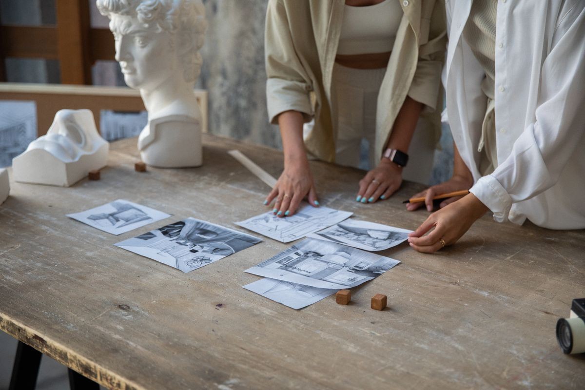
How to do it with a kneaded eraser: 1. Color your
area with moderate pressure 2. Press the kneaded eraser onto the colored
area and lift 3. The eraser picks up pigment, leaving a lighter spot 4.
Repeat to create highlights or texture patterns
How to do it with sticky tac or tape: 1. Apply tape
or sticky tac to a colored area 2. Press gently and lift 3. Pigment
comes off with the tape, creating a textured or highlighted effect
Works best with: A kneaded
eraser, it lifts pigment without damaging the paper. Also works
with regular sticky tac or painter’s tape.
When to use it: Creating highlights on shiny objects
(water drops, glass, metal), adding texture to surfaces (stone, bark,
fabric), or creating a “worn” or vintage look.
5. Stippling
(For Texture and Depth Without Blending)
Stippling is making lots of tiny dots with the tip of your pencil. It
creates texture and depth without needing smooth blending at all.
How to do it: 1. Use a sharp pencil tip 2. Hold the
pencil perpendicular to the paper 3. Make tiny dots close together (dark
area) or far apart (light area) 4. Build up density gradually, more
dots = darker area
The effect: A textured, pointillist look that’s
perfect for natural surfaces, sand, stone, animal fur, bark. It also
works beautifully for creating gradient transitions without any blending
at all.
Works best with: Any pencil with a sharp point. A Kum
sharpener helps maintain that fine tip.
When to use it: For texture, for areas where
blending isn’t working, or when you want a different visual effect on
the same page. It’s also great for backgrounds, a light stipple pattern
in a neutral color is more interesting than a flat wash.
Putting It All Together
The real magic happens when you combine techniques on the same
page:
- Layering + shading = realistic, dimensional
objects - Layering + burnishing = smooth, professional
finishes - Shading + stippling = textured, dimensional
surfaces - Color lifting over layered color = realistic
highlights and reflections
Don’t try to learn all five at once. Start with layering (it’s the
foundation). After 5-10 pages, add shading. Then burnishing. The others
will come naturally as you encounter pages where they’d make a
difference.
For more technique detail, our
blending and shading guide covers layering, burnishing, and solvent
blending in depth.
Recommended
Supplies for Technique Practice
You don’t need every product on this list. But if you’re going to
practice techniques, these make a real difference:
- Prismacolor Premier 72-Color Set, Soft cores that
layer and blend like nothing else. The standard for technique work. (Amazon) - Prismacolor Colorless Blender, Essential for
burnishing. Turns layered color into smooth, paint-like finishes. (Amazon) - Kum Automatic Long Point Sharpener, Technique work
requires a sharp point. This sharpener delivers. (Amazon) - Kneaded Eraser, For color lifting and creating
highlights. (Amazon)
Final Thought
Technique isn’t about making your coloring look like someone else’s.
It’s about having more options. When you know layering, you can choose
to layer, or not. When you know burnishing, you can choose to burnish —
or not.
The goal isn’t perfection. It’s having the tools to express what you
see in your head on the page. These five techniques give you those
tools. Start with layering, add the rest one at a time, and watch your
coloring transform.
n
Read unlimited books? With Kindle Unlimited, read as much as you want from 4M+ titles, including thousands of coloring and art books. Try Kindle Unlimited FREE for 2 months
Bottom Line
Coloring techniques improve with practice, not expensive supplies. Master layering, blending, and pressure control with the pencils you already have. A few intentional techniques will transform your pages more than any gear upgrade.
🎨 Get Your Free Stress Relief Coloring Guide
Join our newsletter and get this free printable plus weekly tips.
Price Check
Prices verified via our product tracker. Updated Sep 27.
| Amazon.com : Prismacolor Premier Colored Pencils, Soft Cor | $74.99 | 4.8★ (29,632) |
| Amazon.com: ARTEZA Colored Pencils, 48 Wax-Based Color Pen | $0.79 | 4.7★ (6,573) |
| Amazon.com: Polychromous Colored Pencil Set In Metal Tin 6 | $79.56 | 4.8★ (4,529) |
| Amazon.com: Faber-Castell Kneadable Eraser for Artists in | $35.00 | 4.7★ (21,212) |
| Amazon.com: Kum AS2, Two Hole Automatic Long Point Pencil | $8.10 | 4.5★ (1,942) |
As an Amazon Associate we earn from qualifying purchases.