This article contains affiliate links. We may earn a commission from qualifying purchases.
Some content on this site is AI-assisted and reviewed by our editorial team.
Knit fabric is the most common thing in fall and holiday coloring books — and the most commonly flattened. You pick a nice warm beige, color the whole sweater in, maybe add some darker lines along the pattern, and step back to find a brown rectangle with stripes. It reads as cloth, not yarn. The difference between that and a sweater you want to reach out and touch comes down to one structural detail almost everyone skips: the V-stitch.
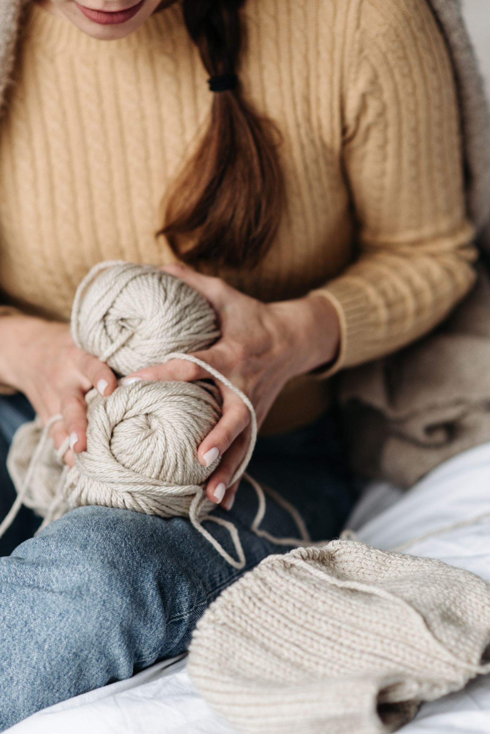
Knit fabric in a coloring book is a grid of stacked V shapes. Color those Vs, and fabric reads as knit. Ignore them, and you get flat felt. Here’s the weave-first method I teach — stroke direction, shadow rows, and the two-color rule that keeps fabric from going flat.
Step 1 — Find the Weave Direction Before You Pick a Color
Before any pencil touches the sweater, trace the weave with your eyes. Coloring-book knit is drawn two ways: as stacked columns of V-stitches, or as smooth vertical wale lines (like fine merino). Whichever the artist drew, your pencil strokes must run along it — never across. Stroke direction is the single highest-leverage decision on this page: Vs get short, stacked, downward-diagonal strokes that follow each V; smooth knits get long, uninterrupted vertical strokes that follow the wales.
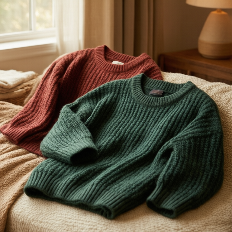
If the book only printed a plain sweater outline with no texture lines, you can invent the weave yourself — but keep it consistent. A sweater colored with left-leaning Vs on one sleeve and right-leaning Vs on the other looks wrong in a way viewers can feel but can’t name.
Step 2 — Lay the Base in Two Colors, Not One
Pick your sweater color, then pick its shadow neighbor — one or two steps darker on the same family tree (beige to light taupe, red to dark red, navy to indigo). The two-color rule: the highlight rows get the light color, the shadow rows get the darker one, and you never mix them mid-row. Two colors make depth; one color makes felt.
Lay the light color first across the whole sweater with light pressure — 2 or 3 on a 10-point scale — following your stroke direction. Then go back and drop the darker color into every second or third row, the rows that would sit under and behind. In a stacked-V knit, the shadow row lives in the bottom half of each V, where the yarn dips under the next stitch.
Step 3 — Build the Weave with Pressure Changes, Not More Colors
Knit texture comes from pressure variation, not from adding a third or fourth pencil. Within each V-stitch, start your stroke at medium pressure and ease off as you go — the bottom of each stitch is where the yarn overlaps and shadows, the top is where it catches light. That one pressure gradient per stitch, repeated down a column, is what makes the fabric breathe.
Two or three layers of the same two colors, with pressure shifting between them, beats four different colors every time. Adding more colors is the most common way people overwork knit fabric — it goes from cozy to confused fast.
Step 4 — The White Thread Highlight, One Per Row
Here’s the finisher: one thin white highlight along the top edge of each shadow row — one, not several. A single white thread per row reads as yarn catching the light; several white lines per row read as plastic. Use a white gel pen or your white pencil, and keep the highlights to the top-left third of the garment, where the light source lives. Skip the right side and the bottom — fabric lit from one side never highlights everywhere.
Work light-handed, and if the line feels too sharp, soften it by going over it with the white pencil. A soft edge reads as fuzz; a hard edge reads as stitching.
Step 5 — Keep the Background Quiet
A sweater that pops needs a quiet background. If your page has one, keep it to two or three colors at light pressure, reserving your deepest darks and highest contrast for the garment itself. If the background is busy, the sweater will fight it and lose.
Common Mistakes
Coloring across the weave: strokes that run perpendicular to the knit lines flatten the texture completely — the eye reads crosshatch as noise, not fabric.
Outlining the Vs: the temptation is to trace each V with a darker pencil. Don’t. Shadow rows build depth; outlines make knit look printed.
Wax bloom on the highlight pass: soft wax cores bloom under repeated layers, and white gel pens skip over heavy wax. If your layers feel greasy, test the gel pen on scrap first or switch to white pencil for the highlights.
Uniform pressure: the most common cause of flat fabric. If every stroke is pressure 4, the whole sweater is pressure 4. Vary it.
The Supplies I Use for Knit and Fabric Texture
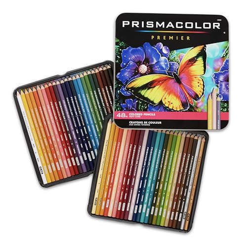
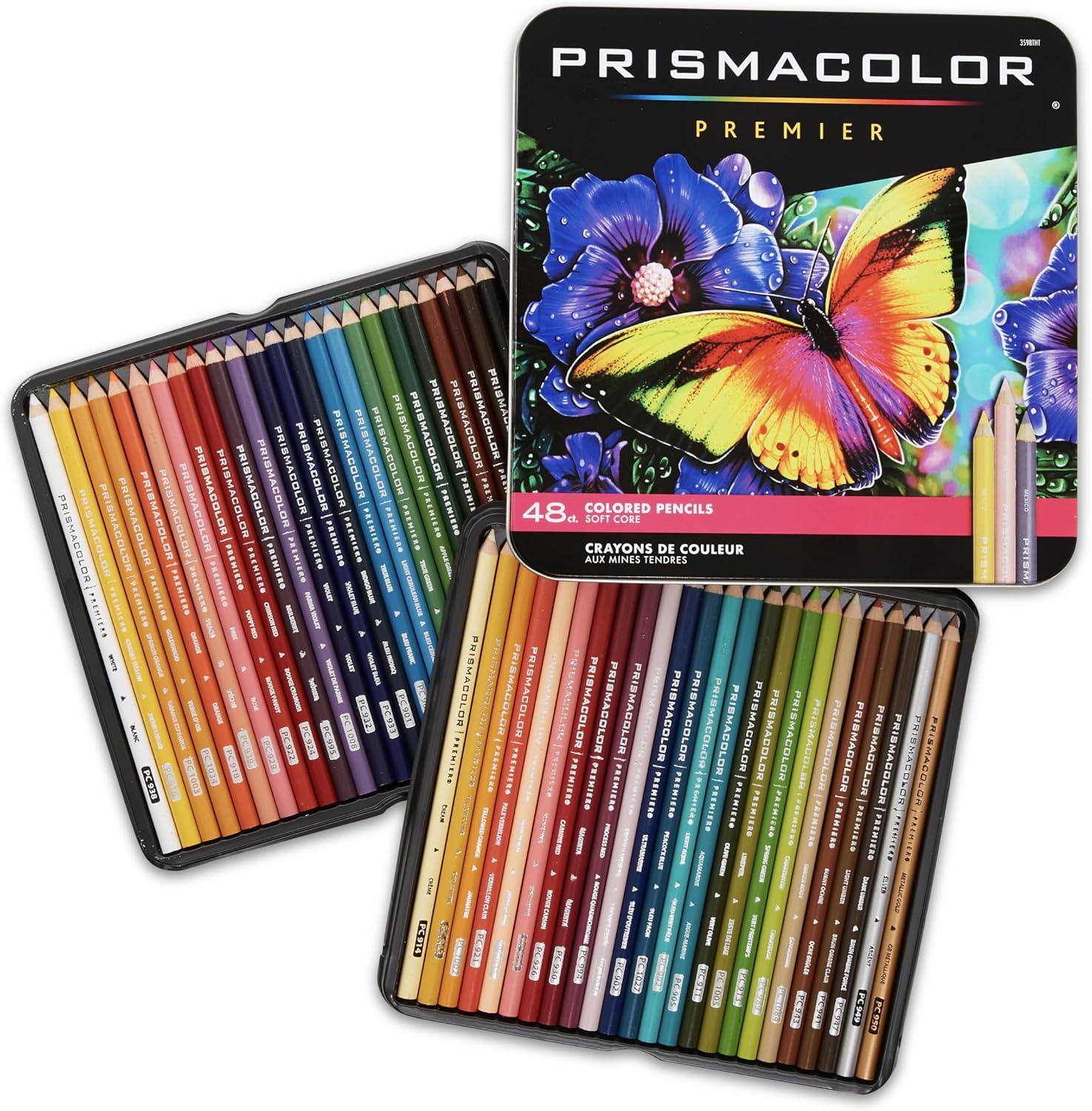
Prismacolor Premier Soft Core Colored Pencils, 48 Count — about $49. Soft wax cores melt into seamless knits under light pressure, which is exactly what the weave-first method needs: light layers that follow the V-stitch. The honest con: heavy layers bloom wax that needs a guard sheet, and the soft cores demand frequent sharpening.
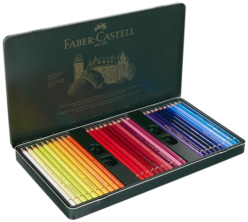
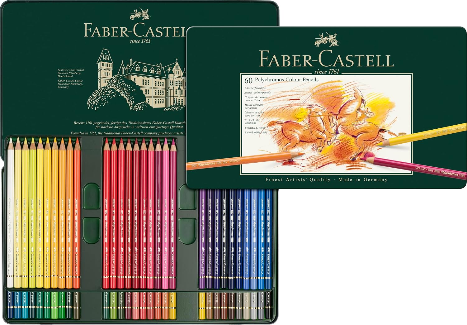
Faber-Castell Polychromos Colored Pencils, Tin of 60 — about $108. Oil-based cores keep fine V-stitch detail crisp where soft wax cores blunt it, and they never bloom. The honest con: roughly three times the price per pencil of student sets, so most colorists should rent this idea with the Prismacolors first.
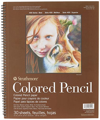
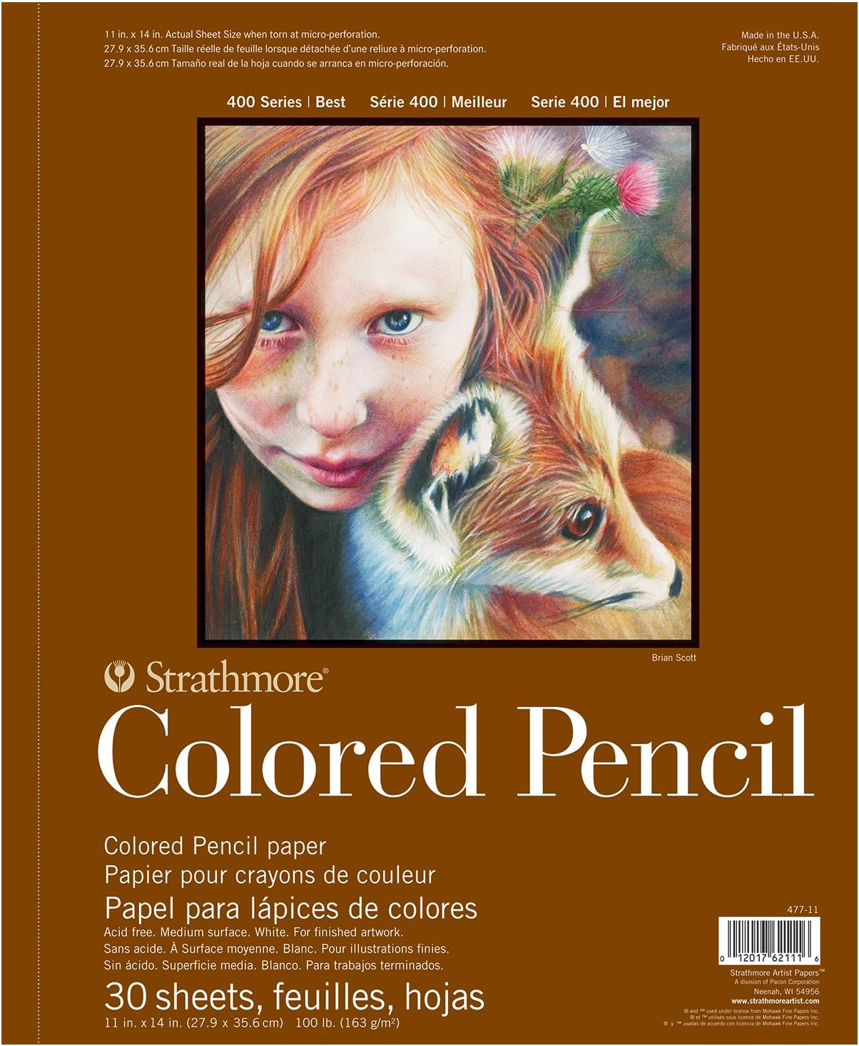
Strathmore 400 Series Colored Pencil Pad, 11×14, 30 Sheets — about $18. The vellum tooth grabs layered weave strokes and holds them, which is what lets three light layers read as texture instead of mud. Con: the paper buckles under solvent blending, so keep this pad dry-media only.
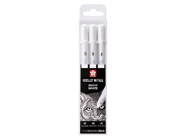
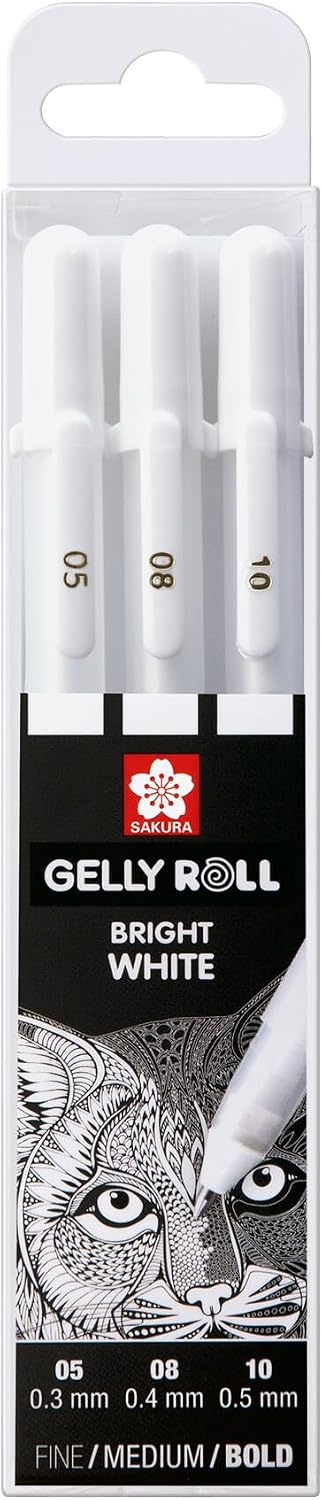
Sakura Gelly Roll Classic White Gel Pens, 3-Pack — about $5.99. The one-tool highlight pass: a thin white thread per row is what makes icing-crisp yarn highlights possible. Con: they skip over heavy wax bloom, so test on scrap if your layers are deep.
Budget note
The whole method works with one mid-range set and one white pen: the 48-count Prismacolors, a Strathmore pad, and the 3-pack of white gel pens come to about $49 + $18 + $5.99 — under $75 total, fully equipped for a whole season of cozy holiday books. The Polychromos tin is the upgrade, not the entry fee.
Deep-focus coloring hits different with an audiobook in your ears — Audible’s free trial is here if you want to try it. And keep reading: the light-first method for sparkle is in How to Color Gemstones and Crystals, and protecting soft cores is covered in Sharpeners That Do Not Crack Colored Pencil Cores.
ColoredCalm is reader-supported. As an Amazon Associate, I earn from qualifying purchases. That means if you buy through one of the links above, I get a small commission at no extra cost to you. I only recommend supplies I actually color with.
My take: Knit fabric lives or dies on the V-stitch grid — trace the weave direction first and stroke along it, never across. The two-color rule (base plus a one-step-darker shadow neighbor, never mixed mid-row) plus pressure variation per stitch beats adding colors every time; more pencils is precisely how cozy turns to confused. A white gel-pen thread highlight at the top of each stitch column is the finishing touch.
Related guides
- Animal Coloring Books for Adults: From Wildlife to Pets, the Best Books and Techniques
- Watercolor Pencils: Four Activation Methods That Stop Mud
- Coloring for Men: Why More Guys Are Picking Up Colored Pencils and Loving It
- How to Frame and Display Finished Coloring Pages
- Coloring on the Go: How to Build a Travel Coloring Kit That Fits in Your Bag
🎨 Get Your Free Stress Relief Coloring Guide
Join our newsletter and get this free printable plus weekly tips.
Frequently Asked Questions
How do you color knitted fabric with colored pencils?
Find the weave first: stacked V-stitches get short diagonal strokes that follow each V, smooth wales get long vertical strokes. Lay a light base, drop a darker shadow color into every second or third row, vary your pressure per stitch, and finish with one white highlight thread per shadow row.
What colors make a sweater look cozy?
Stick to two neighbors from the same warm family — beige with light taupe, or mid-red with dark red — and let pressure changes build the texture instead of adding more colors. Cozy comes from soft contrast and visible weave structure, not from a wider palette.
How do you add texture to fabric in coloring books?
Stroke direction does most of the work: follow the drawn weave, never color across it. Then alternate light and shadow rows, keep the shadow inside the bottom half of each stitch, and add a single white gel pen highlight per row on the lit side of the garment.
Liked this guide? Get the next one in your inbox — the coloring starter checklist is free too.
✓ You're in — check your inbox.
No spam. Unsubscribe anytime. We never share your email.
Prices move fast. Start your Amazon trip from our Shop & Support page and your purchases support ColoredCalm at no extra cost to you.
Price Check
Prices verified via our product tracker. Updated Oct 31.
| Prismacolor Premier Colored Pencils, Soft Core, Assorted C | $48.80 | 4.8★ (16,317) |
| Polychromous Colored Pencil Set In Metal Tin 60pc | $99.99 | 4.8★ (4,529) |
| Strathmore 400 Series Wire Bound Colored Pencil Pad, 100 l | $17.51 | 4.8★ (3,357) |
| SAKURA Gelly Roll Classic White Gel Pen Set, Assorted Size | $5.99 | 4.4★ (17,921) |
As an Amazon Associate we earn from qualifying purchases.