This article contains affiliate links. We may earn a commission from qualifying purchases.
Some content on this site is AI-assisted and reviewed by our editorial team.
Color Theory for Adult Coloring Books: How to Pick Colors That Look Amazing Together
Staring at a half-finished coloring page with thirty pencils scattered across the desk and no idea what goes where. Sound familiar? The line art is done for you, but the color choices? That part is all yours, and it can paralyze you if you let it.
Color theory has this reputation for being dry and academic, but it’s none of that. It’s basically a set of patterns people figured out centuries ago for what looks good next to what. Once you know a few of them, you stop second-guessing and start coloring with confidence. No art degree required.
This guide walks through color theory as it applies to adult coloring books specifically. If you’ve been working on blending and shading techniques, our guide to blending and shading colored pencils pairs well with what follows.

Disclosure: As an Amazon Associate, we earn from qualifying purchases. This post contains affiliate links. If you click and purchase, we may earn a commission at no extra cost to you.
What Color Theory Actually Means for Your Coloring
The name “color theory” is doing it no favors. It sounds like a lecture hall topic. But for coloring, it’s just a framework for making decisions without freezing up.
Every time you color a page, you’re making tons of small choices. What shade for this flower, what hue for that swirl in the background. Without any structure, those choices pile up fast. You either overthink every single one or default to the same handful of pencils on every page.
Color theory gives you a starting point. Pick a color you like, and the framework tells you which other colors will work with it. That’s the whole thing. Once you internalize a few patterns, you spend less time agonizing and more time actually coloring.
Our five coloring techniques to improve your pages covers hands-on methods that complement smart color choices.
The Color Wheel, Your Cheat Sheet for Picking Palettes
The color wheel is simpler than people make it sound. Three primary colors (red, blue, yellow) spaced evenly around a circle. Between each pair, you get secondaries: orange, green, purple. Between those, tertiaries: red-orange, yellow-green, blue-violet, and so on.
What makes the wheel useful is that the position of colors tells you how they relate. Across from each other? Contrast. Next to each other? Harmony. In a triangle? Balance. See those relationships once and palette-building becomes second nature.

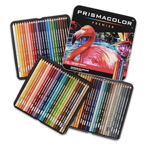
You don’t need to memorize the whole thing. Just know it’s there, and every formula below references where colors sit on it. You can find free color wheels online, and some pencil sets include a mini wheel. The Prismacolor Premier 72-Color Set includes enough hues that palette-building feels effortless.
5 Color Combination Formulas That Always Work
These five formulas cover most of what you’ll need. Try them, mix them, and after a while you’ll stop thinking about them consciously.
1. Complementary Colors, The Bold Contrast Pick
Complementary colors sit directly across from each other on the wheel: red and green, blue and orange, purple and yellow. They create maximum contrast, which makes them look vibrant and a little electric when paired.
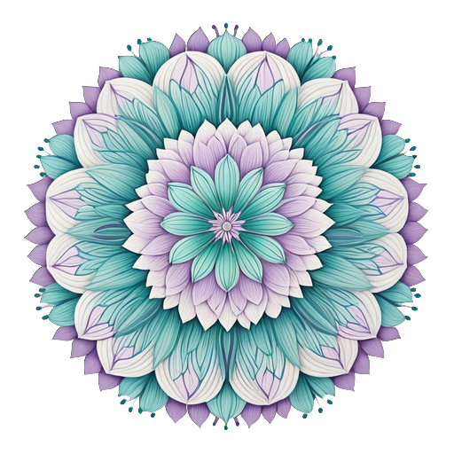
Use this when you want a page to pop. A mandala with warm orange petals against a cool blue background is a good example. The contrast makes each color look more intense than it would alone. The trick is letting one color lead and the other support. Give them equal weight and they fight instead of complement.
Try this: Use one complementary pair per section. Let the dominant color cover about 70% of the space, the complement about 30%. Bold without being chaotic.
2. Analogous Colors, The Smooth and Serene Pick
Analogous colors sit right next to each other: red, red-orange, and orange, or blue, blue-green, and green. They share an underlying hue, so they blend smoothly without any visual friction.
This is the one to reach for when you want calm. Nature uses analogous palettes constantly. A sunset moves from yellow through orange to red. A forest mixes greens and blue-greens. Even a busy page done in analogous colors feels unified and restful.

Try this: Pick three to five neighboring colors. Add a light tint or white as a “breathing room” color so things don’t get muddy.
3. Triadic Colors, The Balanced and Playful Pick
Triadic palettes use three colors evenly spaced around the wheel, forming a triangle. Red-yellow-blue, or orange-green-purple. Each color has equal visual weight, but the overall feel is more dynamic than analogous.
Great for pages with distinct sections. A Creative Haven Creative Cats design where each cat gets its own color identity while the page stays cohesive. Triadic palettes have a playful, energetic quality that suits mandalas, geometric patterns, and whimsical illustrations well.
Try this: Let one color dominate (about 60% of the page), use a second as a 30% secondary, and save the third for 10% accents. Balanced but not boring.
4. Split-Complementary Colors, The Sophisticated Contrast Pick
Start with one color, find its complement across the wheel, then split that complement into its two neighbors. Start with blue, complement is orange, split-complementary pair is red-orange and yellow-orange.
You get the vibrancy of a complementary scheme but with more nuance. Less tension, more sophistication. This is the right choice for detailed pages where you want richness without chaos.
Try this: This approach shines in Johanna Basford’s books like World of Flowers or Enchanted Forest, where intricate line art rewards palettes that feel layered and intentional.
5. Monochromatic Colors, The Elegant Simplicity Pick
Monochromatic means one hue, varied in lightness and saturation. Navy, cobalt, sky blue, powder blue, icy white. All blue, all different.
Probably the most underrated approach. Monochromatic palettes look stunning in adult coloring books because they create depth without any color conflict. A page done entirely in blues can look like moonlight on water. All greens can feel like walking through a sun-dappled forest.

It’s also the most forgiving for beginners. Everything’s in the same family, so almost nothing clashes.
Try this: Pull the lightest, medium, and darkest shades of one color from your set. Add white or cream as a highlight. The Arteza Professional 72-Color Set has enough shades within each hue family to build rich monochromatic pages.
Warm vs Cool, How Temperature Changes the Mood of Your Page
Every color has a temperature, and understanding warm versus cool might be the most practical tool in your kit.
Warm colors (reds, oranges, yellows, warm browns) feel energetic, cozy, close. They seem to advance on a page.
Cool colors (blues, greens, purples, cool grays) feel calm, spacious, distant. They recede.
Neutrals (whites, creams, grays, blacks) can lean either way. A warm gray has a hint of brown. A cool gray has a hint of blue.
Temperature creates mood. A page in all warm tones feels intimate, like a fireside evening. A page in cool tones feels expansive, like a quiet morning by water. Mixing both in one page adds contrast and interest without relying on hue contrast alone.
Ways to put this to use:
- Background vs foreground: Make background elements cool (they recede) and foreground elements warm (they advance). Natural depth, even in a flat coloring page.
- Mood-setting: Pick your temperature based on the vibe. Relaxation? Go cool. Energy and joy? Go warm. Our coloring mindfulness practice guide goes deeper into how intentional color choices enhance the calming effects.
- Temperature within one hue: Even “blue” can be warm (teal, cerulean) or cool (navy, indigo). Mixing warm and cool versions of the same hue adds depth without adding new colors.
The Faber-Castell Polychromos 60-Color Set is great for temperature work. The oil-based cores lay down smooth, even layers that make subtle warm-cool transitions visible. For quality on a budget, our best colored pencils under 50 dollars guide has recommendations.
Building a Limited Palette from a Big Pencil Set
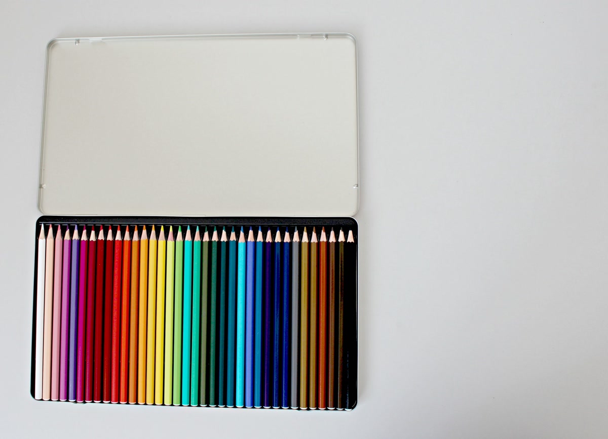
One of the biggest mistakes new colorists make is using all the colors. You open a 72-pencil set and assume more is better. It’s not. Some of the most striking coloring pages use five to eight colors total.
How to build a limited palette that looks deliberate:
1. Start with one color you love. Look at the page. What’s the first color that catches your eye? That’s your anchor. Say it’s a deep teal.
2. Apply a formula. Using teal as your anchor, pick one of the formulas above. Analogous? Grab blue-green, green, a lighter aqua. Complementary? Add warm coral. Monochromatic? Pull your lightest, medium, and darkest teal.
3. Add a neutral. Cream, warm gray, soft white. Neutrals give the eye somewhere to rest so your colors aren’t competing.
4. Cap yourself at 5-8 colors. Pick your pencils and put the box away. Working within constraints forces creativity. The result is a cohesive page that “using everything” can’t match.
5. Test on scratch paper. Color a small swatch of each pencil next to the others before committing. You’ll see immediately if something clashes. Better to find out on scrap paper than on the page.
This approach works well with the Crayola 50-Count set. Affordable, but enough variety to build solid palettes. It pairs nicely with books like Tropical World or The Mindfulness Coloring Book, where simple line art lets your color choices do the heavy lifting.
Common Color Mistakes (And How to Fix Them)
Even with formulas, things go sideways. Here are the mistakes I see most often, and how to recover from them.
Using Too Many Colors
You pick twelve because they’re all pretty, and your page looks like a rainbow exploded. No cohesion, no focal point.
Fix: Pull back to five or six. Choose one or two dominant colors, one or two supporting, one accent. If you’ve already started and it feels chaotic, pick two or three colors to feature and use the rest sparingly. A thin outline here, a tiny fill there.
Forgetting About Value (Light and Dark)
Value is how light or dark a color is. It matters more than hue for making a page look good. A page where everything is mid-tone looks flat, even if the colors are beautiful.
Fix: Include at least one very light color (near white or pastel), one or two mid-tones, and one dark (near black or a deep shade). Darks give structure, lights give sparkle, mid-tones hold it together. In a Secret Garden illustration, deep forest greens alongside pale sage and cream create depth that makes the garden feel real.
Ignoring the Undertone
Some reds lean warm (orange-red), some lean cool (blue-red). Put an orange-red next to a blue-red and they look like they’re from different palettes, even though they’re both “red.” Same with greens, blues, yellows.
Fix: Check each color’s undertone before starting. Mostly warm palette? Keep undertones warm. Mostly cool? Stick cool. When you do mix temperatures, do it on purpose. Warm foreground against cool background, for instance.
Coloring Everything at Full Saturation
Full saturation is the color straight from the pencil, no blending, no layering. A page where every section is at maximum intensity is exhausting to look at. Like someone shouting every word instead of using their inside voice.

Fix: Use light pressure for some areas. Let the paper show through for a softer look. Layer a lighter color over a saturated one to tone it down. Mix in neutrals. The Prismacolor Premier 72-Color Set is good for this because the soft cores blend and layer well, letting you control saturation through pressure.
Choosing Colors That Compete
Two bold, saturated colors next to each other can clash. Not because the hues are wrong, but because both demand equal attention. Your eye doesn’t know where to settle.
Fix: Give one color dominance. Make it bigger, more saturated. Let the other play backup with lighter pressure, smaller areas, lower saturation. Even complementary colors work beautifully when one leads and the other follows.
Want to learn more about color and creativity? Try Audible Premium Plus FREE for 30 days and get 1 free audiobook on color theory, mindfulness, or anything else. Start your free trial
The Mindfulness Connection: Choosing Colors with Intention
Something I’ve noticed from my own coloring practice: choosing colors deliberately can be as calming as the coloring itself.
When you grab whatever pencil is closest, you’re coloring, but you might not be fully present. When you pause, look at the page, think about the mood you want, and pick a palette on purpose, something shifts. You’re making small creative decisions that reflect how you feel or how you want to feel.
The formulas above aren’t just about pretty pages. Analogous for calm, complementary for energy, monochromatic for focus. They’re ways of choosing how to engage with the moment.
Overwhelmed? An analogous or monochromatic palette gives you constraints, and constraints are calming. No agonizing, just gentle related colors flowing together.
Low energy? Complementary or triadic brings contrast and surprise. It wakes up your visual senses and can genuinely lift your mood.
Scattered? Building a limited palette from scratch is an act of creative focus. Gathering, editing, committing. That process is centering in itself.
Color theory isn’t about rules. It’s about having enough structure to feel confident and enough freedom to be creative. When you pick colors with intention, coloring becomes a conversation with yourself, and that’s where the calm really lives.
Next time you’re staring at a blank page with a rainbow of pencils beside you, don’t overthink it. Pick one color you love. Apply a formula. Limit your palette. See what happens. If you want to dig deeper into the mindful side of coloring, our coloring mindfulness practice guide walks through turning your whole session into a grounding ritual.
Trust your instincts. They’re better than you think.
🎨 Get Your Free Stress Relief Coloring Guide
Join our newsletter and get this free printable plus weekly tips.
Price Check
Prices verified via our product tracker. Updated Sep 27.
| Amazon.com : Prismacolor Premier Colored Pencils, Soft Cor | $74.99 | 4.8★ (29,632) |
| Amazon.com: Creative Haven Creative Cats Coloring Book (Ad | $7.99 | 4.8★ (5,312) |
| Amazon.com: World of Flowers: A Coloring Book and Floral A | $16.95 | 4.8★ (6,166) |
| Amazon.com: Enchanted Forest: An Inky Quest and Coloring b | $8.68 | 4.8★ (8,477) |
| Amazon.com: ARTEZA Colored Pencils, 48 Wax-Based Color Pen | $0.79 | 4.7★ (6,573) |
| Amazon.com: Polychromous Colored Pencil Set In Metal Tin 6 | $79.56 | 4.8★ (4,529) |
| Amazon.com: Crayola Adult Colored Pencil Set (100ct), Prem | $24.08 | 4.7★ (55,736) |
| Amazon.com: Tropical World: A Coloring Book Adventure (A M | $14.95 | 4.6★ (654) |
| Amazon.com: The Mindfulness Coloring Book: Relaxing, Anti- | $9.95 | 4.3★ (1,329) |
| Secret Garden: An Inky Treasure Hunt and Coloring Book for | $15.95 | 4.7★ (16,080) |
As an Amazon Associate we earn from qualifying purchases.