This article contains affiliate links. We may earn a commission from qualifying purchases.
Some content on this site is AI-assisted and reviewed by our editorial team.
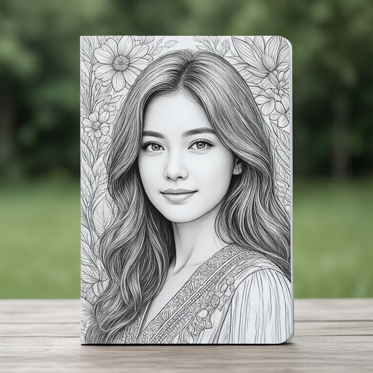
If you’ve never tried grayscale coloring, here’s the frustration that sends most beginners back to regular books: you pick up a colored pencil, start filling in a section, and the result looks flat. The shadow you tried to create is wrong. The highlight you added doesn’t line up with where the light actually falls. The page looks worse than when you started. The fix isn’t more skill — it’s less fighting. Grayscale coloring asks you to let the photograph do the shading and just add color on top. Once that clicks, it’s the most forgiving format in adult coloring.
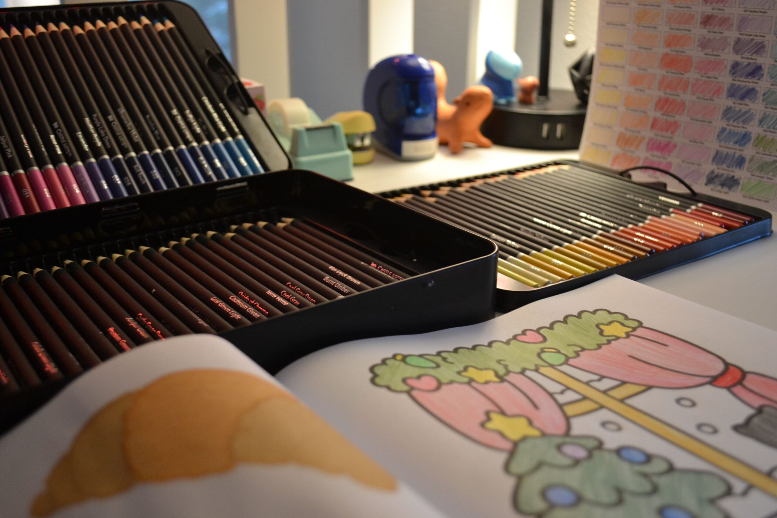
The beginner’s mistake is treating a grayscale page like a regular outline drawing. It’s not. The gray tones printed on the page are your shading map — dark areas stay dark, light areas get your brightest colors, and mid-tones are where you blend. Your job is to add hue, not value. Here’s how to start, which books and pencils are worth your money, and the three mistakes that ruin a first attempt.
Jade Summer Grayscale Coloring Book — The Community-Trusted Brand
Jade Summer is the grayscale brand that Facebook coloring groups recommend by name, and the reason is simple: clean printing, consistent paper quality, and images that survive beginner pencil pressure without ghosting through to the next page. At about $10, it’s the safest first purchase you can make. The variety books (animals, landscapes, florals) give you a range of subjects to find what clicks.
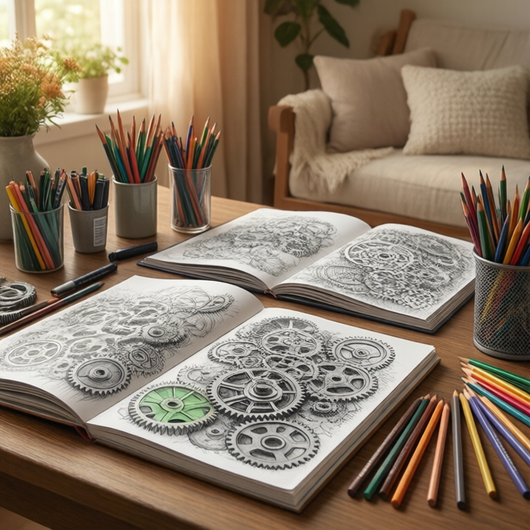
The honest con: not every page is a winner. Some images are softer than others, and the paper tooth is thin for heavy burnishing — if you press hard to blend, you’ll flatten the texture that makes grayscale work. Use light pressure and build layers instead. The perforated pages are a nice touch for framing or scanning.
My take: Start here. One Jade Summer variety book tells you whether grayscale is your format before you invest in pencils or specialized titles.
Pretty Sensible Grayscale Flowers — The Botanical Entry Point
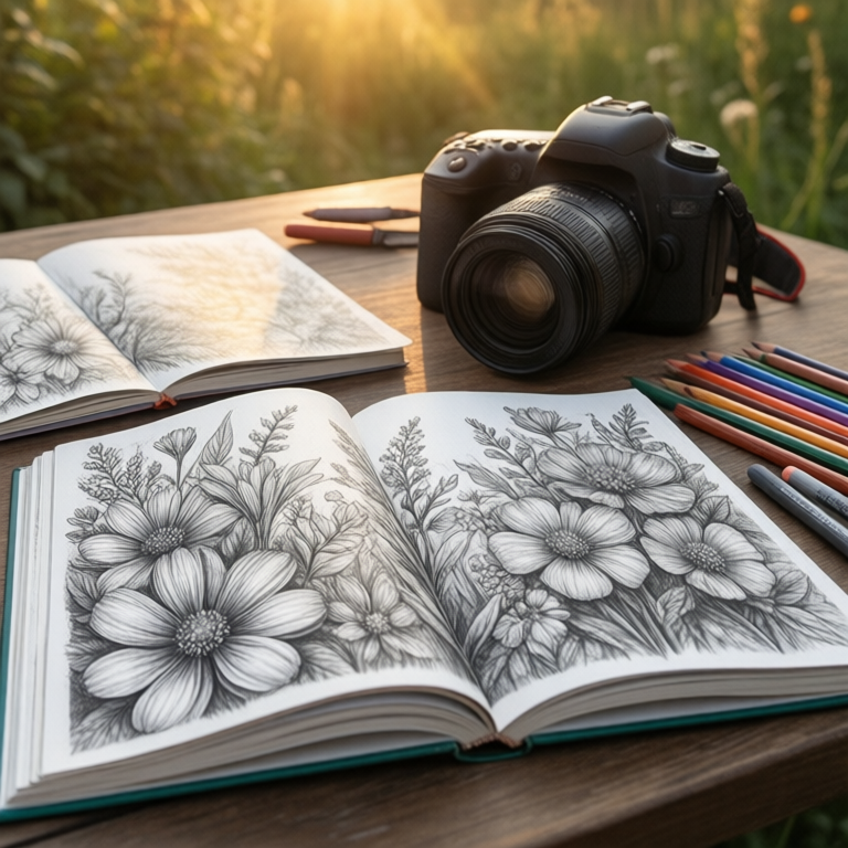
Florals are the classic first-grayscale subject because the photo’s shadows map to obvious petal folds and leaf curves. You don’t have to guess where the shading goes — the gray tones show you. Pretty Sensible’s flower book is a solid entry point at a similar price to Jade Summer, with single-subject focus that lets you practice the same technique across different blooms.
The tradeoff: single-subject books bore fast. If flowers aren’t your thing, you’ll shelve it after five pages. The printer quality varies between printings — some copies arrive with slightly washed-out grays, which defeats the purpose. Check your copy on arrival and return if the shadows look muddy rather than distinct.
My take: The right second book if you loved your first grayscale attempt and want to practice on forgiving floral subjects.
Prismacolor Premier Soft Core Pencils 24 — The Layering Set
The Prismacolor Premier Soft Core 24-pack is the pencil set that makes grayscale coloring feel like painting. Soft wax-based cores glide over the printed gray without fighting it, and the pigment lays down rich enough that two layers cover the darkest shadows without looking chalky. At about $20 for 24 colors, it’s the sweet spot — enough hues for most grayscale pages without paying for the 72-pack you won’t use yet.
The con is the con of every soft-core pencil: they crumble under heavy pressure. Grayscale beginners tend to press hard on day one, and a snapped core is the result. Use light pressure, build layers, and keep a gentle sharpener handy. The soft cores also wear down fast, so you’ll sharpen more often than with harder pencils like Faber-Castell.
My take: The right pencil set for grayscale — soft enough to layer over gray tones without lifting them, cheap enough at 24 to justify before you know if the format sticks.
Monsoon Publishing Grayscale Sampler — The 12-Dollar Tester
If you’re not ready to commit to a full themed book, Monsoon’s grayscale sampler offers multiple subjects in one volume at about $12 — landscapes, portraits, animals, and florals across a single book. It’s the cheapest way to discover which subjects work for your coloring style before buying a dedicated title.
The catch is that sampler curation is uneven by design. Some pages are stunning; others are filler. The paper quality is mid-tier — workable but not as clean as Jade Summer. Think of it as a practice pad, not a portfolio piece.
My take: Worth it if you genuinely don’t know what you like — but if you already lean toward florals or animals, buy the dedicated book instead.
How to Actually Color a Grayscale Page (Three Steps)
1. Pick your darkest pencil first. Find the darkest area on the page and choose the color you want it to be. Lay it down lightly over the dark gray areas. This sets your value range — everything else builds up from here. If you start with the lightest areas, you’ll overshade them by the time you reach the darks.
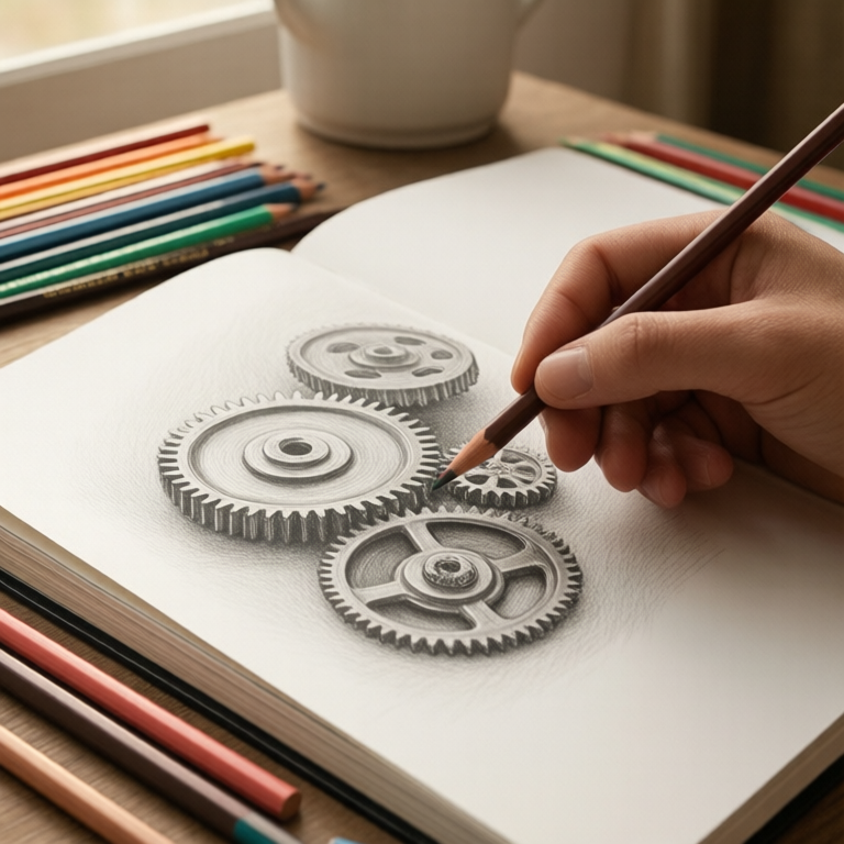
2. Follow the photo’s shadows. The gray tones tell you where to put each color. Dark gray gets your deepest hue, light gray gets your brightest, and mid-gray is where you blend between them. Don’t try to “fix” the shadows — they’re the guide, not the problem. If a petal is darker on the left in the photo, your color goes darker on the left too.
3. Build in thin layers. Three light layers beat one heavy one every time. Each layer fills in more of the paper tooth and deepens the color without flattening the grayscale shading underneath. Stop when the color is rich but the shadow variation is still visible — if the page looks flat, you’ve overworked it.
Common Mistakes That Ruin Grayscale Pages
Pressing too hard: Heavy pressure flattens the printed gray tones, which is the opposite of what you want. If you can’t see the original shadows after coloring, you’ve pressed too hard. Lighten up and add another layer instead.
Using too many colors: Grayscale works best with a limited palette — 3 to 5 colors per page. More colors compete with the shading and create visual noise. Pick a color family and stay in it.
Filling every section solidly: Leave some areas partially colored. The gray paper showing through creates natural texture and depth. Solid coverage looks like a coloring book; partial coverage looks like a painting.
Ignoring the darkest darks: Beginners skip the shadow areas because they look too dark already. Those darks are what give the page dimension — color them deeply and the whole image pops.
Budget Note: Cheapest Setup That Works
One Jade Summer variety book ($10) plus a 24-pack of Prismacolor Premier Soft Core pencils ($20) = $30 total. That’s the floor for grayscale coloring that actually works. You can substitute Crayola for the Prismacolors at half the price, but the harder wax won’t layer over gray tones as smoothly — you’ll fight the format instead of letting it help you.

Keep reading: Once you’ve got the grayscale basics, our gel crayons guide covers a bold alternative for tired hands, and the detail-pencil method handles the tiny spaces grayscale pages are full of. For the evening routine that makes coloring stick, the audiobook-and-coloring evening is the fix for the second-screen habit.
Deep-focus coloring hits different with an audiobook — Audible’s free trial is here. ColoredCalm is reader-supported. As an Amazon Associate, I earn from qualifying purchases. That means if you buy through one of the links above, I get a small commission at no extra cost to you. I only recommend supplies I actually color with.
Related Guides
- Worlds of Wonder and 3 More Books That Earn Their Price Tag
- Large-Print Coloring Books for Tired Eyes: 5 Picks That Do Not Punish Fine Motor Skills
- Grip-Friendly Coloring Supplies: What Actually Saves Arthritic Hands
🎨 Get Your Free Stress Relief Coloring Guide
Join our newsletter and get this free printable plus weekly tips.
Frequently Asked Questions
What is grayscale coloring?
Grayscale coloring uses a printed photograph with its shadows and highlights as the shading guide. You add color on top of the gray tones instead of creating shading from scratch — the photo does the shading for you.
Do you need special pencils for grayscale books?
No, but soft-core pencils like Prismacolor Premier work best because they layer smoothly over the printed gray without lifting it. Harder pencils fight the format.
How is grayscale different from regular coloring books?
Regular coloring books use line art with no shading — you create all the depth yourself. Grayscale books print the photograph's tonal values, so your job is adding hue while the paper handles light and shadow.
Liked this guide? Get the next one in your inbox — the coloring starter checklist is free too.
✓ You're in — check your inbox.
No spam. Unsubscribe anytime. We never share your email.
Prices move fast. Start your Amazon trip from our Shop & Support page and your purchases support ColoredCalm at no extra cost to you.