This article contains affiliate links. We may earn a commission from qualifying purchases.
Some content on this site is AI-assisted and reviewed by our editorial team.
Flowers are where most colorists get humbled. They look simple — petals, a center, done — and then your first rose comes out looking like a pink paper plate. I did that more than once before I understood what was going on: flowers are not about coloring petals. They’re about coloring the gaps between petals. The shadows and overlaps make a flower read as a flower.
The good news is that this is one of the most learnable skills in colored pencil. Petal shapes repeat, light behaves predictably on curved surfaces, and once you’ve internalized three or four specific habits, every floral page in your stack gets easier. This is the practical version — pressure, stroke direction, and color choices that hold up at coloring-book paper weights, not just on hot-press bristol.

One rule before any technique: pick your light source before you pick up a pencil. Every petal on the page bends toward or away from that one light. Without that decision made first, you’ll shade each petal by feel and the flower will look like five different flowers glued together.
Habit One: Stroke Direction Follows the Petal, Not Your Wrist
The single biggest flower fix: your pencil strokes should run the length of the petal, from base to tip, following its curve. When strokes run sideways across a petal, you get stripes; when they follow the petal’s growth direction, you get structure. This one habit separates “colored in” from “shaded” more than any blender ever will.
Practically: start at the petal base with medium pressure, feather toward the tip while lifting, so each stroke ends light. Two passes with a mid-tone gives you a petal that already looks curved before any shadow. For rounded petals like peonies, curve the stroke with the petal’s belly — draw the petal’s skin, not its outline.
Habit Two: Overlap Shadows Are the Whole Illusion
Where one petal sits in front of another, the back petal catches a shadow along the edge it shares with the front petal. That thin shadow band — darker at the base where the petals meet, fading as it runs out — is 80% of why colored flowers look dimensional. Find the overlap lines on your line art before you color anything: they’re the map of your entire shading plan.
Use a deeper tone of the petal’s own color for these shadow bands, never straight black or gray — a pink rose’s overlap shadows live in raspberry or plum. Black shadows kill florals because they disconnect the shadow from the petal; related dark tones keep the flower whole.
Habit Three: Three Tones Per Color, No More
Pick a light, a mid, and a dark version of every petal color before you start — say, blush, rose, and raspberry for a pink flower. Everything you do is some combination of those three. This constraint is not a limitation; it’s what keeps the flower unified. The most common mud I see in floral pages comes from adding a fourth and fifth “just to fix” tone mid-page.
Layer order matters: mid-tone first across the whole petal (your base), light tone over the areas turning toward the light, dark tone in the overlaps and the petal base. Burnish only at the very end if at all — heavy burnishing early is how you get wax bloom and tooth damage nothing will stick to afterward.
Habit Four: Centers Are Darker Than You Think
Flower centers — the stamens, the disc of a daisy, the heart of a magnolia — are almost always the darkest-value zone on the flower. New colorists leave centers light because the line art is open there, and the whole flower goes flat. Go dark in the center: deep browns, violets, or the darkest version of your petal hue. Then drop a few white gel pen highlights between the stamen lines at the very end, and the center pops forward like it was embossed.
Supplies That Make Florals Easier
You do not need much. After a lot of pages, these are the picks I keep reaching for:
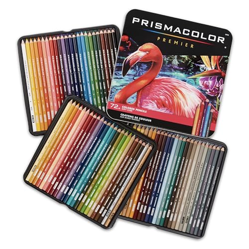
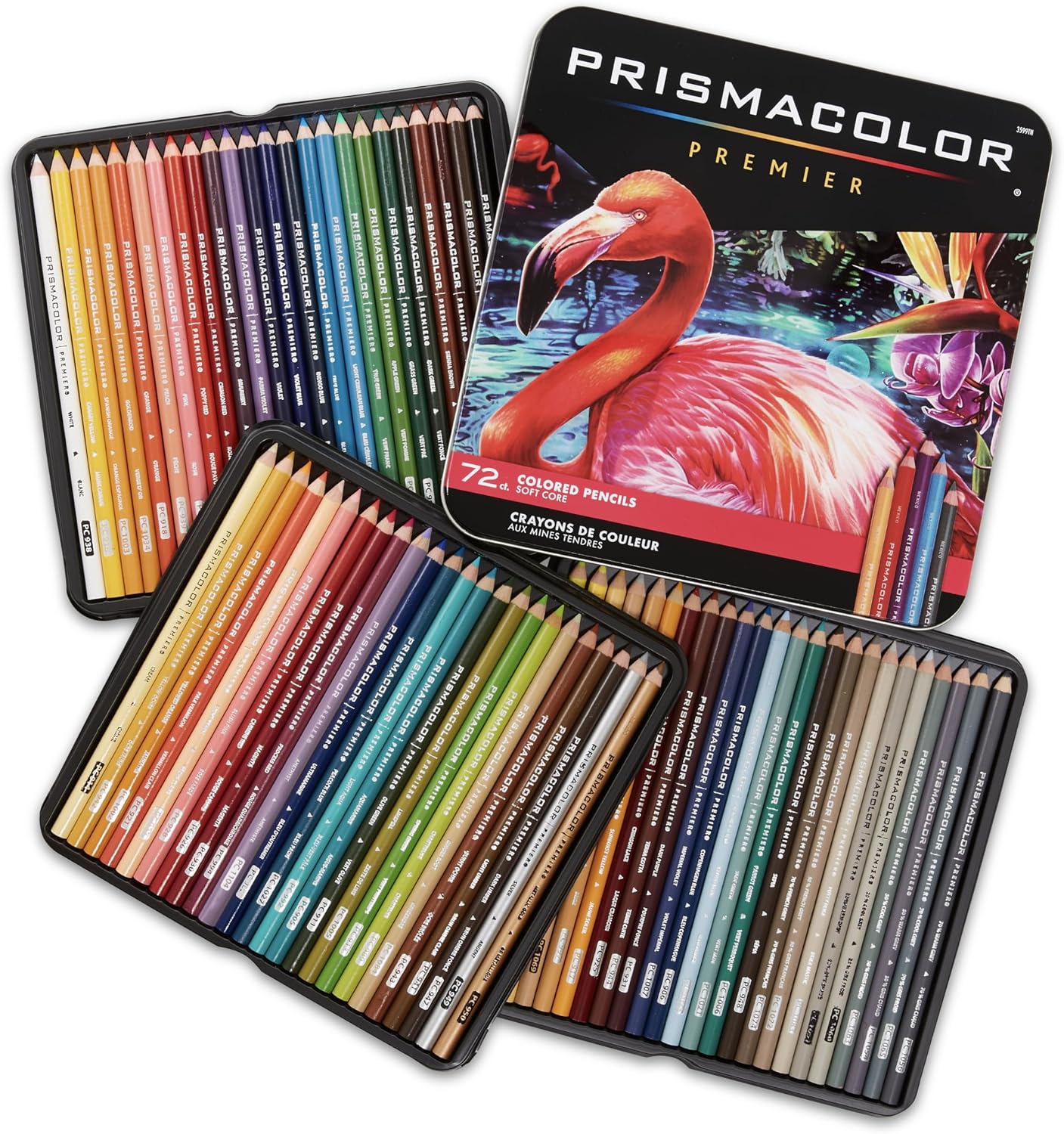
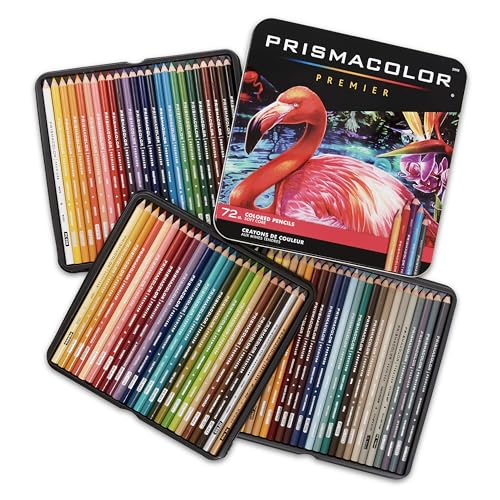
Prismacolor Premier Soft Core (72-count) at about $74 — the soft-core standard for a reason: the pigment lays down creamy enough to blend on coloring-book paper without crushing the tooth. My go-to for the rose-to-raspberry transitions florals live on. Con: soft cores break if you drop them, and they go blunt fast, so a good sharpener matters.
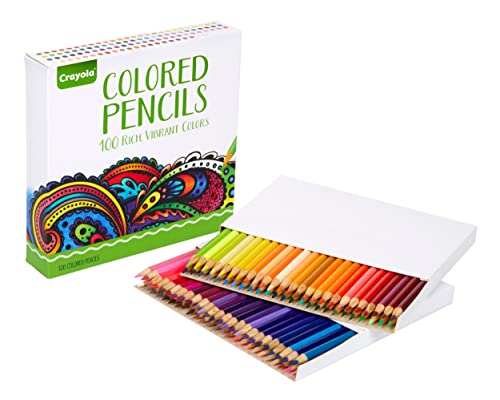
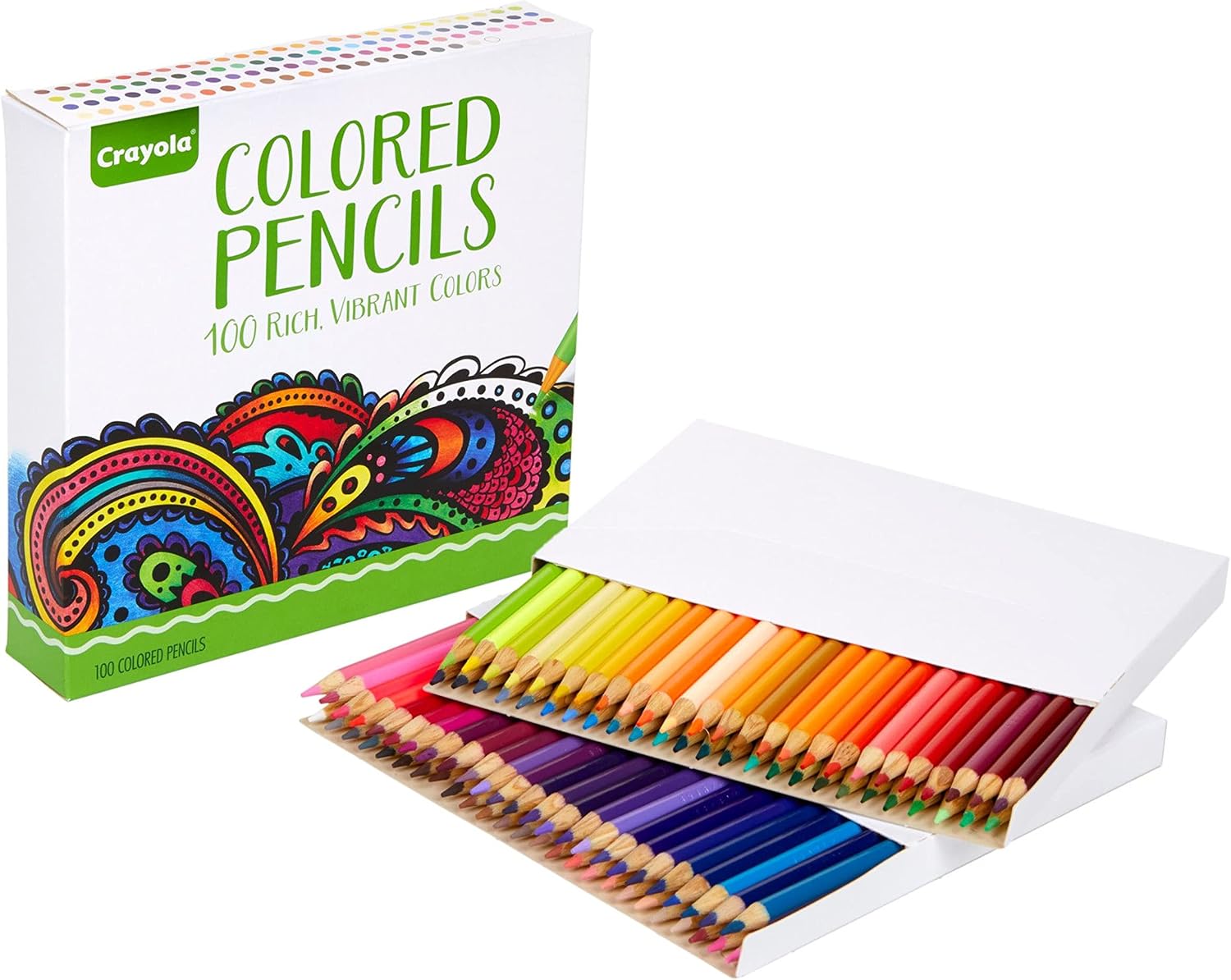
Crayola Adult Colored Pencils (100-count) at about $16 — the budget pick that earns its slot honestly. Harder core than Prismacolor, which is a genuine advantage on thin book paper: less wax, less bloom, and they hold a point. The color range in the 100-box covers every floral scheme. Con: the blending ceiling is lower — two-tone layering looks great, four-tone gradients start to fight you.
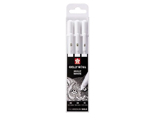
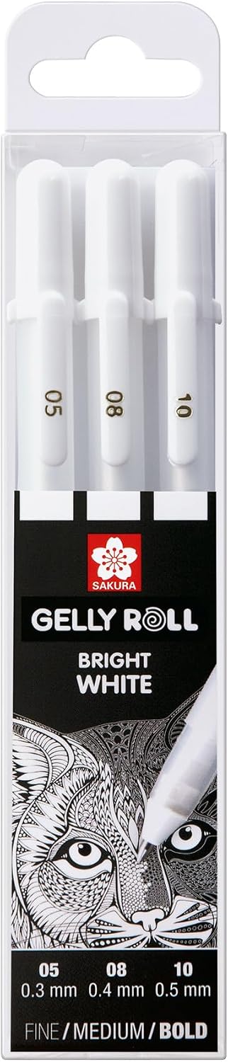
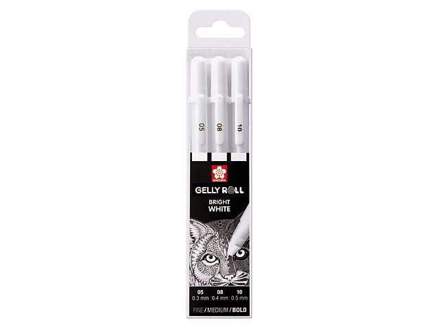
Sakura Gelly Roll Classic White (3-pack) at about $6 — the finishing tool. White gel pen is how you add the dew-drop highlights and stamen sparkles that make a flower look lit from within. Nothing else does this job on toothy paper. Con: press too hard and the blob is forever — practice dots on a scrap corner first.
Three Books That Teach Flowers While You Color Them
Technique sticks faster when the line art is drawn to teach it. These three do:
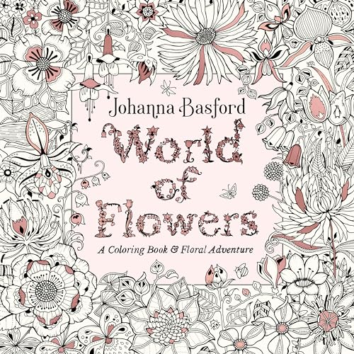
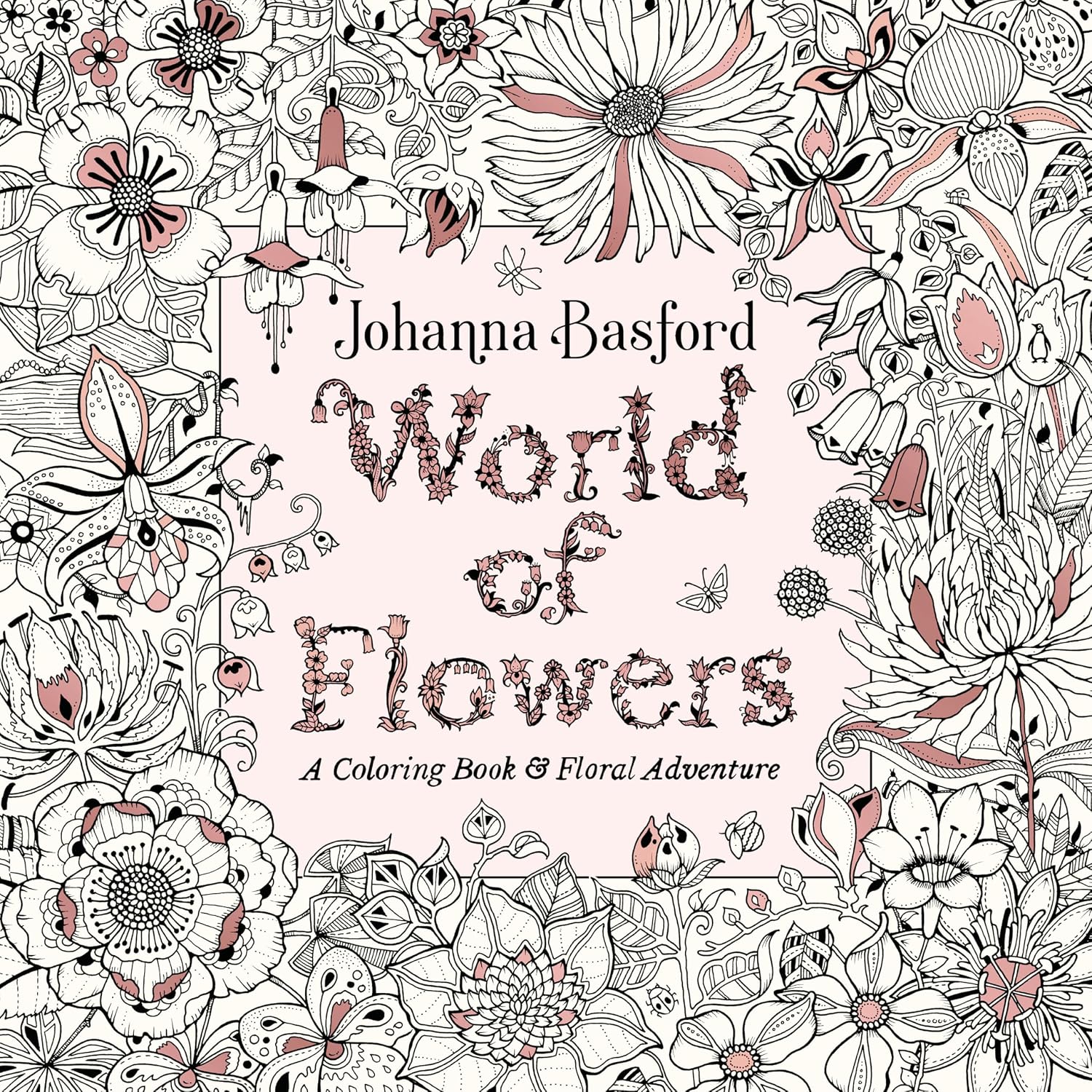
World of Flowers by Johanna Basford at about $9 — 80 pages of botanical density from the artist who started the adult coloring wave. Her petal overlaps are drawn with the shadow gaps already implied, which trains your eye while you color. Con: pages are double-sided, so alcohol markers are off the table — pencils only, which for this tutorial is perfect.
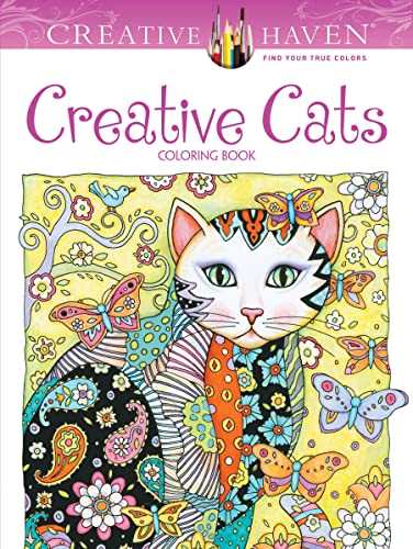
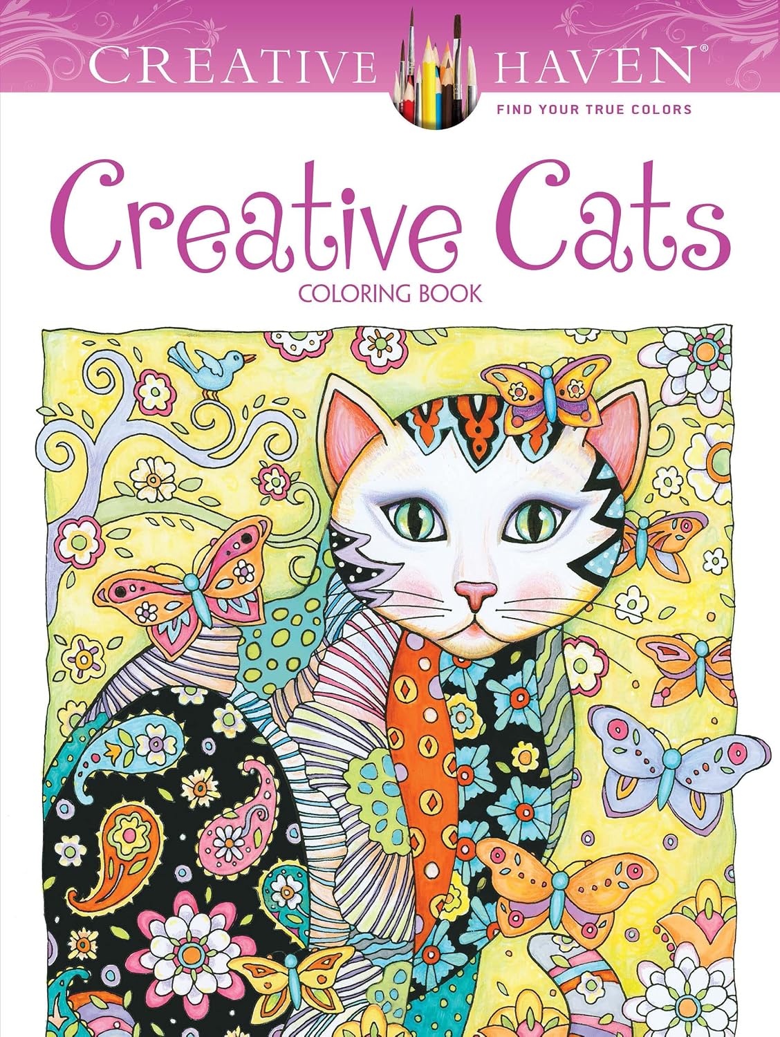
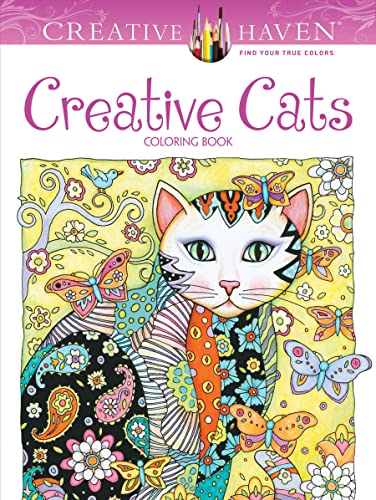
Creative Haven Creative Cats at about $7 — Creative Haven’s single-sided pages and 64 flower-and-feline designs make it the low-pressure practice ground: cats plus florals, where a slightly muddy rose hides behind a very good cat. Con: lighter paper than Basford, so keep layers thin.
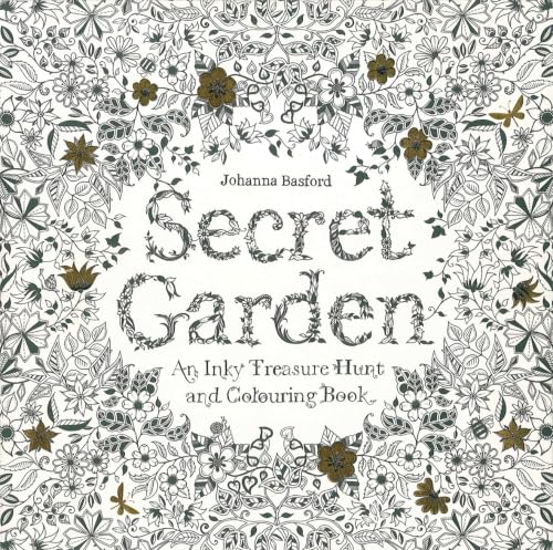
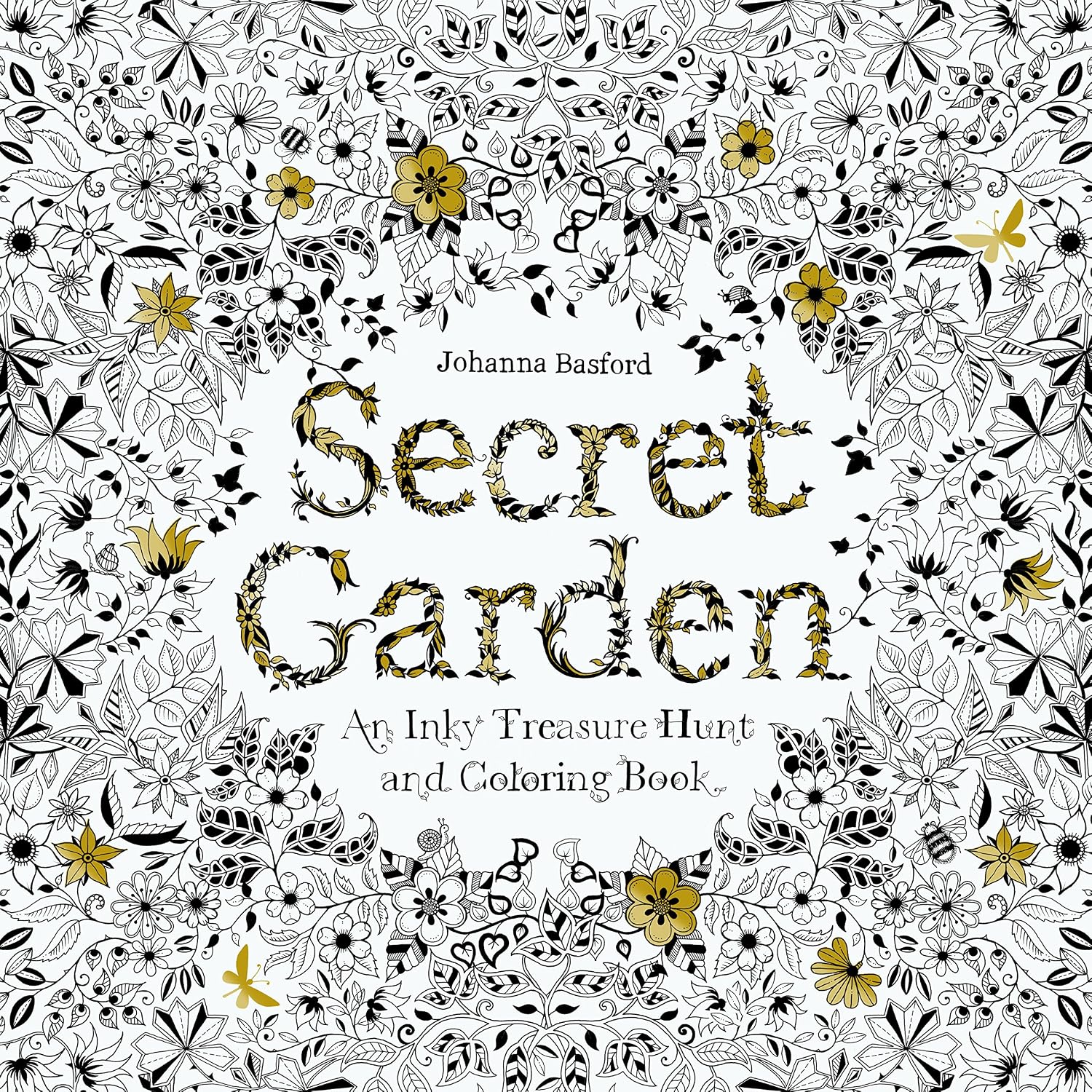
Secret Garden by Johanna Basford at about $9 — the classic, 96 pages, and still the best “graduation book” once the habits above feel natural: denser scenes, smaller petals, more overlap decisions per page. Con: the density that makes it rewarding makes it slow — plan on weeks, not evenings.
Common Mistakes (That I Still Make When I’m Rushed)
Coloring every petal the same direction. Petals fan out from the center; strokes should fan with them. All-vertical strokes on a fan-shaped flower flatten it instantly.
Reaching for black. Petal shadows belong to the petal’s own color family. Raspberry under rose, violet under lavender, chestnut under yellow.
Skipping the base tone. Jumping light-to-dark without a mid-tone first means the two never integrate — you get stripes with gaps instead of a gradient.
Ignoring the back of the flower. Turn to a real flower and look at the outer petals: they curve away from you and catch light on their backs. A single pale rim on the outermost petals suggests the whole hidden structure.
The Budget Note
If you’re starting from zero: the $16 Crayola 100-box plus the $6 white gel pen plus one $7 book is $29 all-in, and that setup colors every floral page here honestly. Upgrade to Prismacolor when your pages ask for blends the hard cores can’t give — not before. The pencils don’t make the habits; the habits make the flower.
Keep reading: the autumn-leaves page that pairs with this for seasonal florals and the gradient method that underlies all of it.
ColoredCalm is reader-supported. As an Amazon Associate, I earn from qualifying purchases. That means if you buy through one of the links above, I get a small commission at no extra cost to you. I only recommend supplies I actually color with.
My take: Flowers are the gaps between petals, not the petals — overlap shadows in related dark tones (raspberry for a pink rose, never black) carry 80% of the dimension. Strokes run base-to-tip following the petal’s curve, and three tones per color is the discipline that keeps florals unified. The light-source decision comes before any pencil touches paper.
Related guides
- Color Theory for Adult Coloring Books: How to Pick Colors That Look Amazing Together
- How to Choose the Right Paper for Your Coloring Books
- Color by Number for Adults: Why Structured Coloring Is Making a Comeback
- Reverse Coloring Books: Why Coloring the Background First Changes Everything
- Floral Coloring Books for Adults: How to Bring Flowers to Life on the Page
🎨 Get Your Free Stress Relief Coloring Guide
Join our newsletter and get this free printable plus weekly tips.
Frequently Asked Questions
How do you make flower petals look dimensional?
Three-part answer: strokes that follow the petal's length, a darker tone of the petal's own color in every overlap shadow, and a dark center. Those three habits create dimension before any fancy blending.
What colors make good flower shadows?
Deeper versions of the petal's own family — raspberry under pink, plum under lavender, burnt orange under yellow. Avoid black and gray, which disconnect the shadow from the petal.
Can you blend colored pencils on regular coloring book paper?
Yes, with light layered burnishing: build base layers gradually, maximum three tones per color. Heavy single-pass pressure is what kills thin book paper.
How do I keep my white gel pen highlights from blobbing?
Test on a scrap corner of the same page, keep the pen moving, and place dots rather than strokes for dew highlights. A blob is permanent, so slow down on the final pass.
Liked this guide? Get the next one in your inbox — the coloring starter checklist is free too.
✓ You're in — check your inbox.
No spam. Unsubscribe anytime. We never share your email.
Prices move fast. Start your Amazon trip from our Shop & Support page and your purchases support ColoredCalm at no extra cost to you.
Price Check
Prices verified via our product tracker. Updated Oct 17.
| Prismacolor Premier Colored Pencils, Soft Core, 72 Count | $74.49 | 4.8★ (29,632) |
| Crayola Adult Colored Pencil Set 100ct, Premium Coloring P | $16.00 | 4.7★ (55,732) |
| SAKURA Gelly Roll Classic White Gel Pen Set, Assorted Size | $5.99 | 4.4★ (17,921) |
| World of Flowers: A Coloring Book and Floral Adventure | $8.94 | 4.8★ |
| Creative Haven Creative Cats Coloring Book (Adult Coloring | $7.99 | 4.8★ (5,312) |
| Secret Garden: An Inky Treasure Hunt and Coloring Book for | $9.39 | 4.8★ |
As an Amazon Associate we earn from qualifying purchases.