This article contains affiliate links. We may earn a commission from qualifying purchases.
Some content on this site is AI-assisted and reviewed by our editorial team.
Colors Carry Weight

You have probably noticed it without thinking about it. On a gray morning, you reach for something warm to wear. In a quiet room, a red painting on the wall pulls your attention like a magnet. Colors change how we feel, and more importantly, they give us a way to show what is happening inside when words do not quite work.
Disclosure: As an Amazon Associate, ColoredCalm earns from qualifying purchases. This post contains affiliate links, which means we may earn a commission if you click through and make a purchase, at no additional cost to you.
Coloring is one of the simplest ways to use that connection between color and emotion. You do not need to paint a masterpiece or understand color psychology in depth. You just need to pick up a pencil that matches your mood, or challenges it, and start filling in lines. This guide walks you through how to use color intentionally in your coloring practice to express, process, and shift your emotional state.
Why Color and Emotion Are Connected
The link between color and feeling is not just poetic, it is neurological. Research shows that warm colors (reds, oranges, yellows) can increase heart rate and create a sense of energy or urgency, while cool colors (blues, greens, purples) activate the parasympathetic nervous system and promote calm. This is not a subtle effect: a 2026 study published in Mindfulness found that structured coloring with intentionally chosen colors significantly reduced anxiety compared to unstructured doodling.
When you color, you are not just occupying your hands. You are creating a feedback loop. You choose a color that reflects your mood, the act of applying it reinforces or shifts that feeling, and the finished section gives you visible evidence of your emotional state, something you can look at, step back from, and understand differently than when it was just a weight in your chest.
This is why art therapists have used color-based exercises for decades. And you can do the same thing at your own kitchen table, with nothing more than a coloring book and a set of Prismacolor Premier colored pencils.
How to Match Colors to Your Emotional State
There is no universal color-emotion dictionary. Your associations are personal, shaped by memories and experiences. But there are patterns that most people share, and they are a useful starting point until you develop your own emotional color vocabulary.
When You Feel Anxious or Overwhelmed
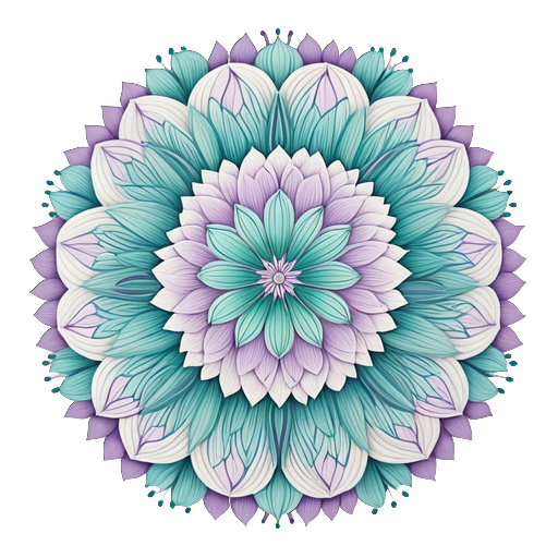
Reach for blues and greens. These cool colors slow your heart rate and signal safety to your nervous system. Try a monochromatic blue palette on a mandala page, the repetition of selecting, applying, and blending similar shades creates a rhythm that quiets mental noise. A Mindfulness Coloring Book with its simple, symmetrical patterns is ideal for this kind of calming work.
When You Feel Sad or Low
Resist the urge to match the feeling with grays and browns. Instead, try warm yellows and soft oranges, colors that simulate sunlight and gently lift your energy without demanding it. Think of the way a candle changes the feeling of a dark room. You are not forcing cheerfulness; you are adding warmth to a cold moment.

When You Feel Angry or Frustrated
Let it out with reds and deep oranges, but channel it through structure. A detailed geometric pattern gives the intensity somewhere to go, each small section you fill is a contained unit of energy, and the requirement to stay within the lines prevents the anger from spiraling. When you finish the page, you have transformed raw frustration into something with form and color.
When You Feel Numb or Disconnected
Choose contrasting colors, complementary pairs like blue and orange, or purple and yellow. The visual tension between opposites creates stimulation that can help you feel present again. Skip the soft, muted tones. Go for saturation and contrast, like turning up the brightness on a screen that has gone dim.
When You Feel Restless or Bored
Try a triadic palette (three evenly spaced colors) on a page with lots of small details. The variety keeps your brain engaged, and the fine motor work of coloring intricate sections gives your restlessness a productive outlet. The Creative Haven Creative Cats coloring book has the kind of detail density that absorbs a wandering mind.
The Emotional Color Journal: A Simple Practice
One of the most effective ways to develop your emotional color vocabulary is to keep a small record of what you colored and how you felt. You do not need anything elaborate, just a few notes.
- Before you start: Rate your mood on a scale of 1-10 and note the dominant emotion.
- Choose your palette based on that emotion using the guide above.
- Color for 15-20 minutes. Do not judge the result, just let the process happen.
- After you finish: Rate your mood again. Has it shifted?
- Note the colors you used and whether you would choose them again for that mood.
Over time, patterns emerge. You might discover that blue-green always calms you, or that yellow does nothing for your sadness but coral helps. Your color-emotion map becomes uniquely yours.

When to Choose Opposite Colors on Purpose
Matching your palette to your mood is intuitive. But sometimes the most powerful thing you can do is choose the opposite of what you feel. This is not about denial, it is about gentle counterbalance.
If you are anxious and you color with anxious reds, you might amplify the feeling. If you are sad and you choose gray, the page becomes a mirror that reinforces the weight. Choosing cool colors when you are anxious, or warm colors when you are sad, creates a small intervention, a color that says, “I see how you feel, and here is something different.”
The trick is intention. If you deliberately choose blue to calm your anxiety, the color works with your awareness. If you reach for blue unconsciously because you always do, the effect is weaker. The difference is in the choosing.
Coloring Through Difficult Emotions Safely
Coloring can support emotional processing, but it is not a replacement for professional help. If you are dealing with grief, trauma, or persistent mental health challenges, coloring can be one tool in a larger toolkit, not the only one.
Some guidelines for coloring through hard emotions:
- Set a time limit. Fifteen to twenty minutes is enough. You can always extend, but having an exit prevents you from getting stuck in heavy feelings.
- Choose structured pages. Mandalas and geometric patterns give you boundaries that feel containing, not restricting. Open-ended blank pages can sometimes amplify emotional overwhelm.
- Notice when you need to stop. If coloring is making you feel worse, put the pencils down. The point is relief, not endurance.
- Follow up with care. After an emotional coloring session, do something grounding, a walk, a cup of tea, a conversation with someone you trust.
Supplies That Support Emotional Coloring
When you are using color for emotional purposes, the quality of your supplies matters more than you might think. Scratchy, pale pencils that require heavy pressure create tension in your hands and break the meditative flow. Smooth, pigment-rich pencils let you apply color gently, which keeps your body relaxed while your mind works.
A few recommendations for emotional coloring work:
- Prismacolor Premier 72-Color Set, the softest core pencils available, requiring almost no pressure. Ideal when you want the process to feel easy and flowing.
- Faber-Castell Polychromos 60-Color Set, oil-based pencils that layer smoothly without wax buildup. Great for building emotional depth through transparent layers.
- Prismacolor Colorless Blender, smooths transitions between emotional color zones so the page feels cohesive, not fragmented.
- Kum Automatic Long Point Sharpener, sharp pencils make precise marks, which matters when you are coloring intricate patterns during emotional moments.

The Bottom Line
Coloring gives you something rare: a way to show how you feel without having to explain it. The colors you choose are a conversation between your emotional state and your creative instincts, and every page you finish is a snapshot of where you were in that moment. Some pages will be calm and blue. Some will be fierce and red. All of them are valid. The practice is not about making pretty art, it is about giving your feelings a place to go that is safer than keeping them inside. Pick up the pencil that calls to you today, and trust that it knows something your conscious mind has not figured out yet.
n
Want to listen to books on the go? Try Audible Premium Plus FREE for 30 days and get 1 free audiobook on mindfulness, creativity, or anything else. Start your free trial
Bottom Line
Color is a language for emotions. Use warm tones for energy, cool tones for calm, and let your color choices reflect how you feel. Coloring your feelings is about expression, not accuracy.
🎨 Get Your Free Stress Relief Coloring Guide
Join our newsletter and get this free printable plus weekly tips.