This article contains affiliate links. We may earn a commission from qualifying purchases.
Some content on this site is AI-assisted and reviewed by our editorial team.
You Know the Feeling

You open a coloring book, find a page you love, grab your pencils, and then… nothing. You stare at 72 colors and have absolutely no idea which ones to use. Do you go warm? Cool? Rainbow? You end up picking the same five pencils you always use, and the page looks fine, but it does not look the way you imagined.
Disclosure: As an Amazon Associate, ColoredCalm earns from qualifying purchases. This post contains affiliate links, which means we may earn a commission if you click through and make a purchase, at no additional cost to you.
Here is the thing: choosing a color palette is not about talent or instinct. It is a skill, and there are practical methods that make it way easier than standing there hoping inspiration strikes. Whether you are coloring a mandala, a nature scene, or an abstract pattern, these six approaches will help you pick colors that work together every single time.
Method 1: The One-Color Strategy (Monochromatic)
If you want a page that looks cohesive without any guesswork, pick one color and use every version of it you own. If you choose blue, that means light blue, navy, teal, cerulean, sky blue, and every shade in between. The result feels calm and unified, like a single mood captured on paper.
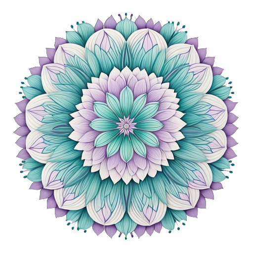
Monochromatic palettes work especially well for mandalas, ocean scenes, and any page where you want a meditative, soothing vibe. The trick is to use a wide range of values, press lightly for pale tints and firmly for deep shades so the page does not end up flat.
For the best range of shades in a single color family, the Prismacolor Premier 72-Color Set gives you 4-5 variations of every major hue, which makes monochromatic coloring surprisingly easy.
Method 2: The Neighbor Strategy (Analogous)
Pick a color on the color wheel, then grab the two colors next to it. Blue plus blue-green and blue-violet. Orange plus red-orange and yellow-orange. These neighboring colors share undertones, so they always look harmonious together, like a sunset that fades from gold into rose without a harsh line anywhere.
Analogous palettes are probably the most forgiving method for beginners. Even if your shading is rough or your color transitions are not perfectly smooth, the colors themselves will carry the page. Nature uses analogous palettes all the time, think of a forest floor in shades of green, brown, and gold.
This method shines with floral pages, botanical designs, and any nature-inspired illustration. The Faber-Castell Polychromos 60-Color Set is organized by color family, which makes finding your analogous neighbors intuitive.

Method 3: The Opposites Strategy (Complementary)
Choose two colors directly across from each other on the color wheel: red and green, blue and orange, purple and yellow. Complementary palettes create contrast and energy. The colors make each other pop, a red flower looks more vibrant against green leaves than it ever could on its own.
The key to making complementary palettes work is proportion. Let one color dominate (about 70 percent of the page) and use its complement as an accent (about 30 percent). If you use both colors equally, the page can feel tense instead of dynamic. Think of a mostly blue sky with pops of orange in a sunset, that ratio feels exciting, not chaotic.
Complementary palettes are great for fantasy pages, bold abstract designs, and any illustration where you want visual drama.
Method 4: The Triangle Strategy (Triadic)
Imagine a triangle on the color wheel connecting three colors that are evenly spaced: red, yellow, and blue, or orange, green, and violet. Triadic palettes are vibrant and playful, they have more variety than analogous or complementary schemes, but they still feel balanced because the colors are mathematically related.
Like complementary palettes, proportion matters. Pick one color as your dominant (about 60 percent), use the second color for secondary elements (about 30 percent), and save the third for small accents and highlights (about 10 percent). This keeps the page from looking like a random color explosion.
Triadic palettes are perfect for whimsical pages, children’s-style illustrations, and any design where you want cheerful variety. The Arteza Professional 72-Color Set has excellent coverage across all color families, making triadic schemes easy to assemble.
Method 5: The Nature Strategy
Skip the color wheel entirely and borrow from the world around you. Think about the palette of a specific place or moment: autumn leaves (amber, rust, olive, chocolate), a beach at noon (sand, turquoise, coral, white), a lavender field at dusk (purple, sage, dusty pink, gray-blue).
This method works because nature already solved the harmony problem. These combinations have evolved over millions of years to look balanced and pleasing. You are not guessing, you are copying the best designer you know.
To use this method, pick a real scene and list 4-6 colors you remember from it. Then match those colors to your pencils. It helps to keep a small notebook where you jot down color combinations you notice during the day, a market display, a garden, even the contents of your spice rack.

Method 6: The Mood Strategy
Let how you want to feel drive your palette. This is less about theory and more about intuition, which is what makes it feel freeing when the other methods feel too structured.
- Calm and relaxed: Blues, soft greens, lavender, pale gray
- Warm and cozy: Terracotta, amber, cream, soft brown
- Energetic and bold: Red, hot pink, bright orange, electric blue
- Nostalgic and gentle: Dusty rose, sage, cream, muted gold
- Mysterious and deep: Deep purple, midnight blue, forest green, black
The mood method turns coloring into emotional self-care. You are not just filling in lines, you are creating a visual environment that matches or shifts how you feel. On a stressful day, reach for cool blues and greens. When you need energy, grab the warm end of the box.
Putting It All Together: Your Palette-Building Workflow
Next time you sit down to color, try this sequence:
- Look at the page. What is the subject? A floral design leans analogous. A fantasy creature wants complementary contrast.
- Check your mood. Are you seeking calm or energy? Let that narrow your starting color.
- Pick one method. Do not combine methods on the same page, pick one and commit.
- Pull 5-8 pencils before you start. Having them pre-selected prevents mid-page second-guessing.
- Test on scrap paper. Color a small swatch next to each other. If two pencils clash, swap one out before you commit to the page.
Keep a kneaded eraser handy for lightening areas that feel too heavy, sometimes a palette just needs a little breathing room.
Quick Palette Cheat Sheet
Keep this reference nearby when you color:
- Monochromatic: One color, all its shades, elegant and calm
- Analogous: Three neighbors on the wheel, harmonious and easy
- Complementary: Two opposites, bold and energetic (70/30 ratio)
- Triadic: Three evenly spaced, vibrant and playful (60/30/10 ratio)
- Nature-inspired: Borrow from a real scene, authentic and grounded
- Mood-based: Match colors to feelings, personal and intuitive

The Bottom Line
Choosing a color palette does not require artistic genius. It requires a method. Any one of these six approaches will give you better results than randomly pulling pencils and hoping for the best. Start with the one that resonates most, probably analogous or nature-inspired if you are new to this, and experiment with the others as you build confidence. The more palettes you try, the faster your eye develops. Eventually, you will look at a page and just know which colors belong there. Until then, these methods have your back.
If you want a pencil set that makes palette-building easier, the Prismacolor Premier 72-Color Set offers the widest range of shades within each color family, and the Kum Automatic Long Point Sharpener keeps every pencil ready for precise color work.
n
Not a Prime member yet? Get FREE 2-day shipping on millions of items, plus access to Prime Video, Prime Music, and Prime Reading. Start your 30-day Prime free trial
Bottom Line
Choosing a color palette gets easier with practice. Start with three to five colors that feel right for your mood, then expand as your confidence grows. There are no wrong choices, only discoveries.
🎨 Get Your Free Stress Relief Coloring Guide
Join our newsletter and get this free printable plus weekly tips.